

2024

E-Commerce Shopping Cart
This end-to-end research and redesign effort delivered a modern shopping cart UI optimized to drive user confidence proceeding to checkout.
Stay tuned at the bottom to learn about how I created a new design handoff process, increasing development accuracy and speed — reducing QA time by 50%.
End-to-end design
Global Audience
Workflow Improvement
Project Overview
End-to-end design process to re-design the Burton.com Shopping cart.
Who
Burton Snowboards is a global leader in snowboards, outerwear, and apparel. Known for quality and style, the brand serves a lifestyle-driven audience of outdoor enthusiasts.
Project Timeline
- UX Research and Design – 4 Months
- Development and QA Testing – 4 Months
Scope
1 page, Desktop and Mobile
Team
- UX Designer – Kimberly MacKenzie
- UX Researcher – Bethany Jasmin
- Project Manager – Cierra Ralph
- Developers – Burton internal web development team
Stakeholders
- Regional e-commerce teams
- Global web merchandising team
- Burton Guides (Customer Service)
- Growth marketing team
Tools
- Research: Content Square, Userlytics
- Design: Figma
Want to see it in action?
Check it out live !
And while you’re at it, consider buying some really cool gear :)
- Background
The Burton.com shopping cart required a code refactor, providing an opportunity to re-design the UI and stand-up new features requested by stakeholders. Cart abandonment was high (65%), leading our team to investigate what features might be added or optimized to instill user confidence proceeding to checkout.
My Role:
As the UX designer, I led wireframing, prototyping, and high-fidelity mockups for development handoff. I partnered with our UX researcher to turn insights into design decisions and collaborated with developers to establish a scalable handoff process. I was responsible for researching and implementing Figma Dev mode, training developers on the feature and its integrations with our design library and Jira ticketing system.
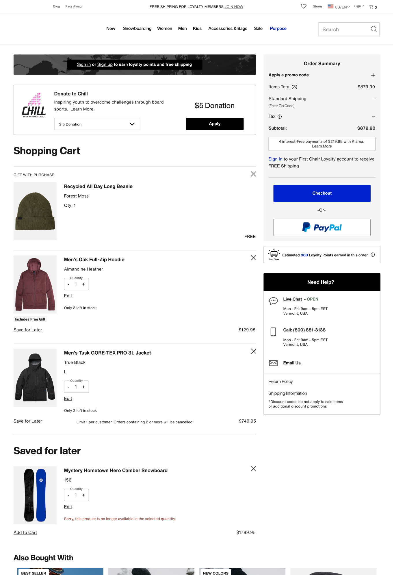
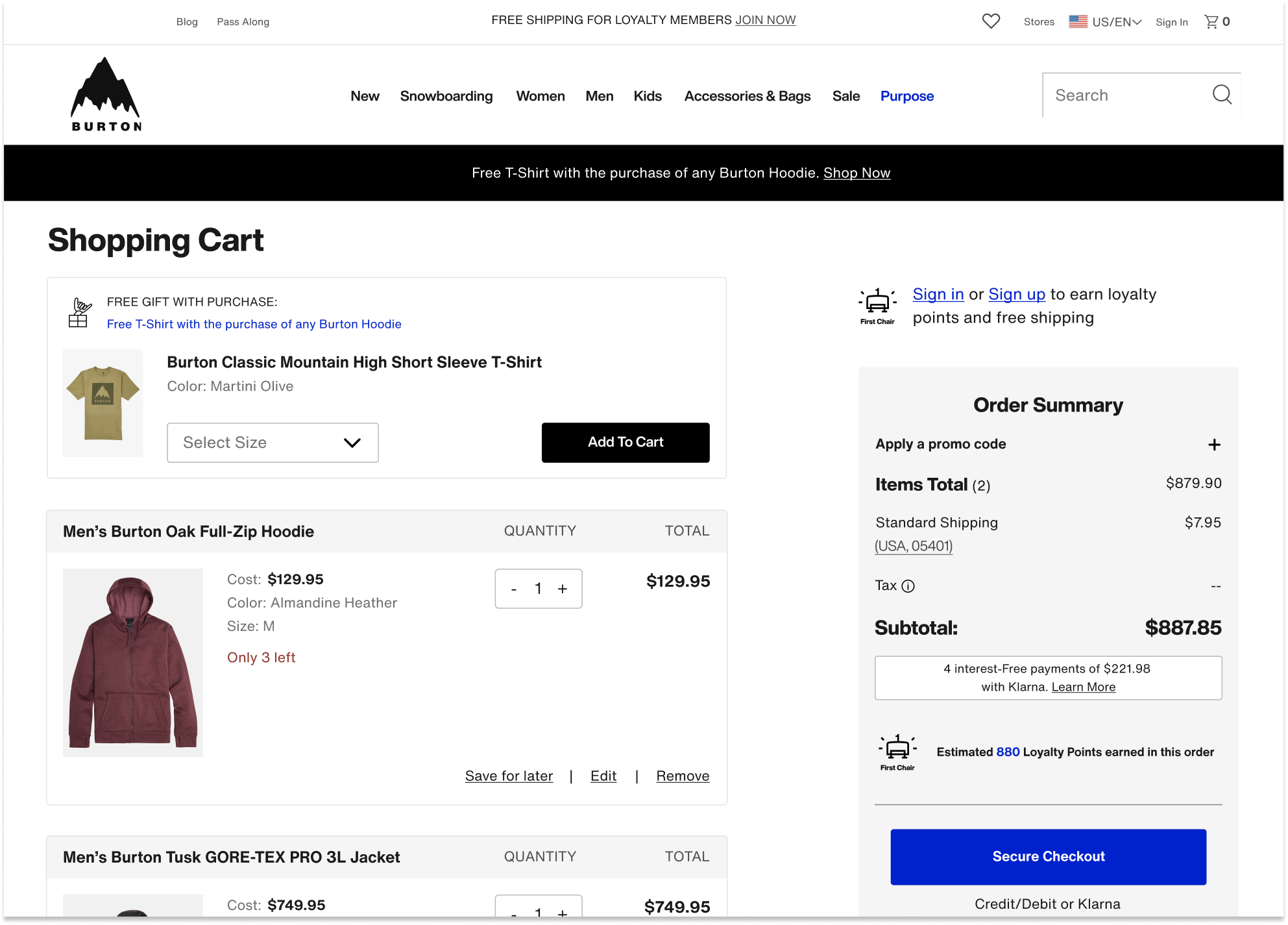
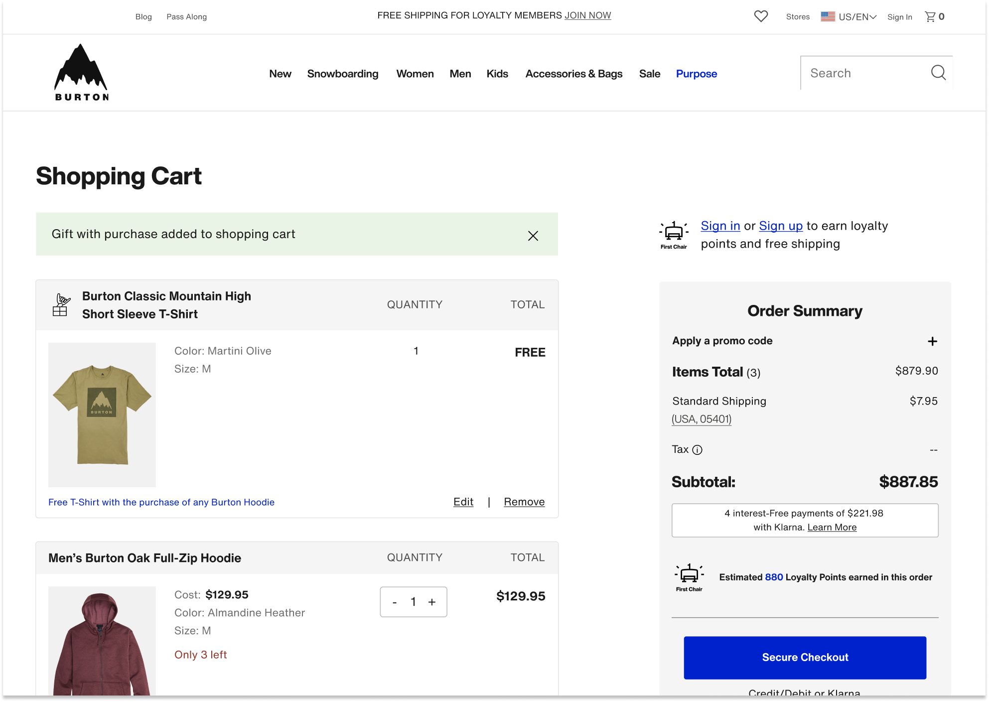
Old Cart Design:
Desktop:
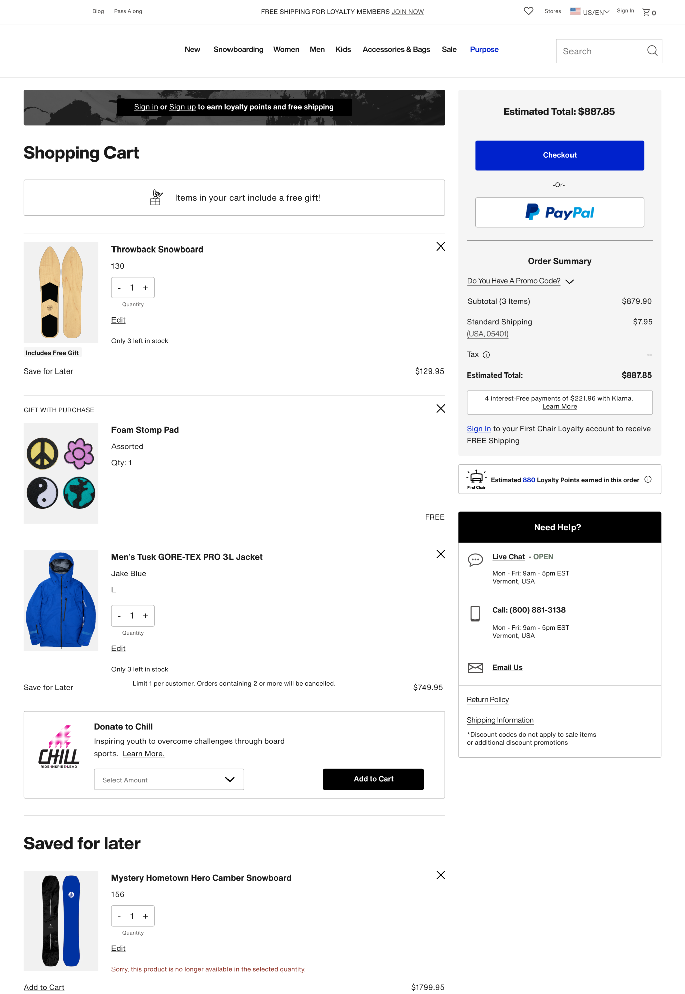
Mobile:
Mobile cont’d:
- UX Discovery
As a UX team, we gathered information from the following sources to identify project goals:

- Site Analytics & Heuristic Evaluation
- 65% Cart Abandonment Rate:Burton.com had a 65% Cart abandonment rate (slightly above average)
- Mobile conversion rate was low:Mobile traffic was significantly higher than desktop, with much lower conversion rates. While this behavior is somewhat typical, there was opportunity to increase conversion on mobile.
- UI Design was dated and bloated:While old design was effective, it looked dated, and years of bloat led to overly word copy and complicated pricing. We hypothesized that clearer language and modernized design would increase user confidence and trust.
- Opportunity to improve user control and freedom.The old site lacked confirmation and “undo” of actions like removing items, saving them for later, etc.
- No mention of Loyalty program benefitsWe recently launched a loyalty program that offered free shipping, points per order, and 2X points for Chill donations. None of this was called out in the cart.
- Stakeholder Requirements
- Optimize promo code feature:Across global regions, merchandising teams required promotion capabilities including the ability to both stack and overwrite, tie to specific products or categories, require codes or auto-apply.
- More flexible gift with purchase feature:Merchandisers desired an enhanced gift with purchase feature to include size selection. Customer service teams cautioned that they often received return requests for gifts with purchase thought to be received by accident.
- Add an “Edit Item” featureThis feature was out the box with Salesforce and required minimal development lift.
- Increase Chill Donations:Our non-profit affiliate, Chill Foundation, asked that we explore ways to increase Chill donations from the cart.

- Third Party Research
(Baymard Institute, Nielsen
Norman Group)
- Reasons for cart abandonment:Research told us key reasons for cart abandonment had to do with extra costs at checkout, slow delivery, complicated checkout processes, and concerns with payment security.
- Hide promo code field behind a link:Research recommendations included hiding Promo codes behind a link to avoid distracting users, while still making the feature easily findable and codes easy to apply.
- Competitor Analysis
- Reviewed best in class examples:We scoured the web to explore best in class checkout examples to learn how other sites displayed clear pricing, communicated shipping speeds and fees, and instilled trust and payment security.
- Understand user expectations:For feature requests like gift with purchase and edit item, we explored examples within our competitor landscape and beyond to understand user’s mental models so we could design for familiarity.


Design Opportunities
- Reduce 65% Cart Abandonment Rate
- Increase mobile conversion by optimizing mobile checkout flow
- Improve clarity and trust with modernized design, simplified copy, and straightforward pricing
- Complete the user journey for new First Chair Loyalty program
Problem Statement:
Burton.com needed a shopping cart design that enabled users to proceed to checkout with confidence,
clarity, and ease.


Constraints
We reviewed our discovery findings and subsequent UX goals with our development team and identified the following constraints:
- Needed to leverage salesforce reference architecture (SFRA)To stay within scope, the redesigned features needed to align with the native behaviors of SFRA, which the development team used to rebuild the cart.
- User Expectations vs. Shipping and Return Policy RealtiesUser research highlighted a strong expectation for free shipping and returns, but the existing policy required users to pay—creating a challenge in building trust and confidence through the cart experience.
- Project scope was limited to the cart pagerequested features needed to exist on the cart page and could not be implemented in different parts of the user journey. In example, gift with purchase could not be introduced earlier in the user flow, and promo code fields could not be added to checkout.
- Prototyping and Usability Testing
Building on our discovery findings, we launched a usability study across North America and Europe, testing three desktop and three mobile prototypes with varying information architecture and key feature designs.
Three Prototype Layouts:
Prototype 1:
Prototype 2:
Prototype 3:


Usability Study

Overall Usability:


Research Goal:
Validate design usability across all three protypes and identify preferred overall layout

Finding:
All three prototypes got a positive response and were perceived as clean and easy to use.

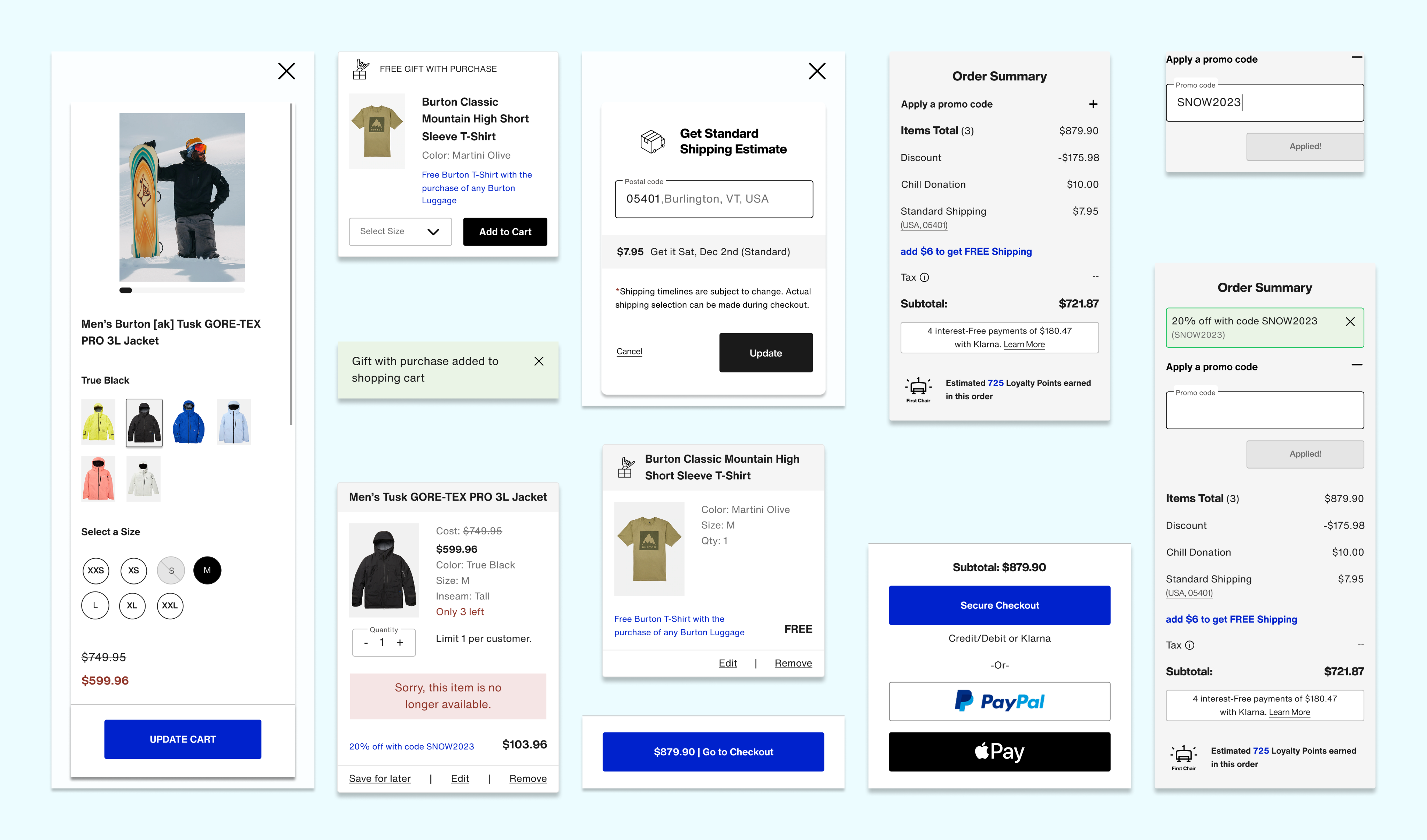
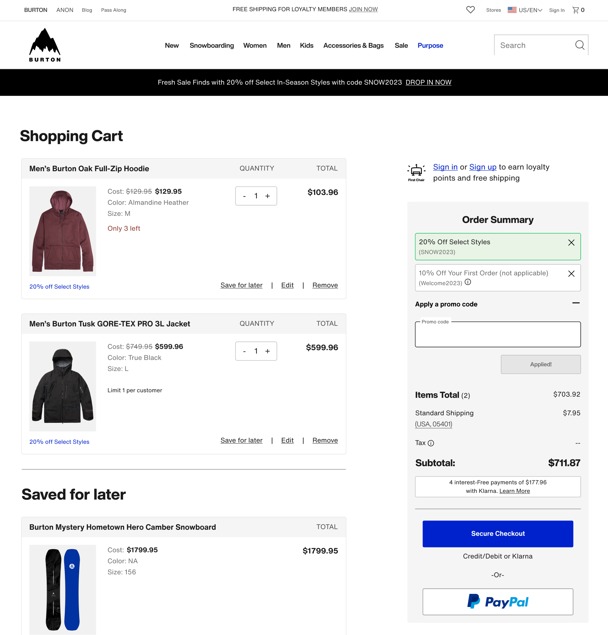
- Final Design Highlights
Promo code: distilling complexities into intuitive interactions with clear pricing

Accommodates various promotion types that are stackable
Placed promo code behind a link. This maintained find-ability while reducing
user distraction.
Introduced valid/invalid states for applied codes. Solving for technical constraint inhibiting overwrites on inactive codes.
Enabled a nano-banner at top of the cart that displays current promo codes for easy recognition rather than recall.
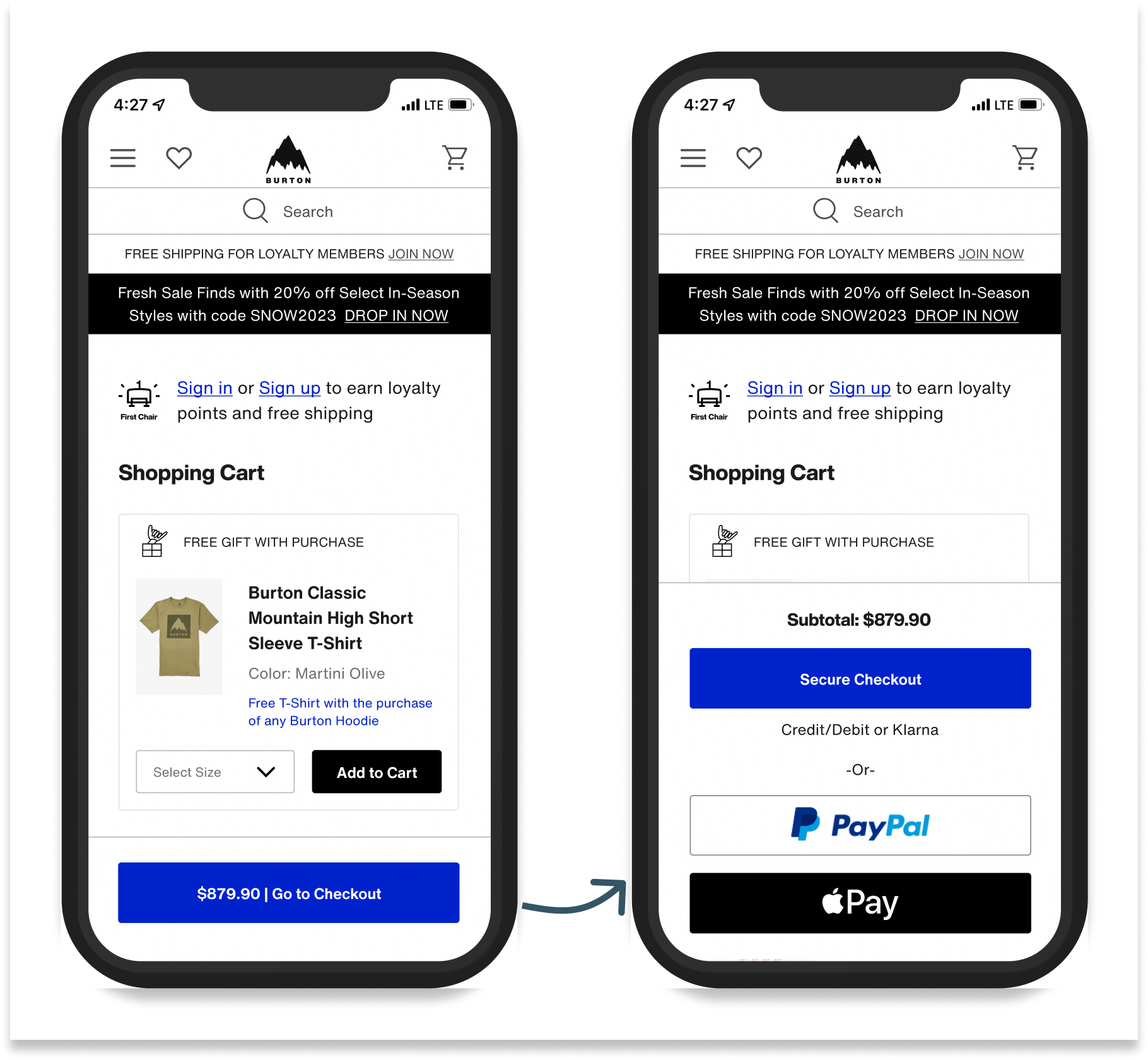
Mobile Sticky Checkout Button:
one clear path forward to checkout
Nested all payment types behind a sticky Checkout button
Reduced cognitive load and increased speed to checkout by presenting one clear path forward
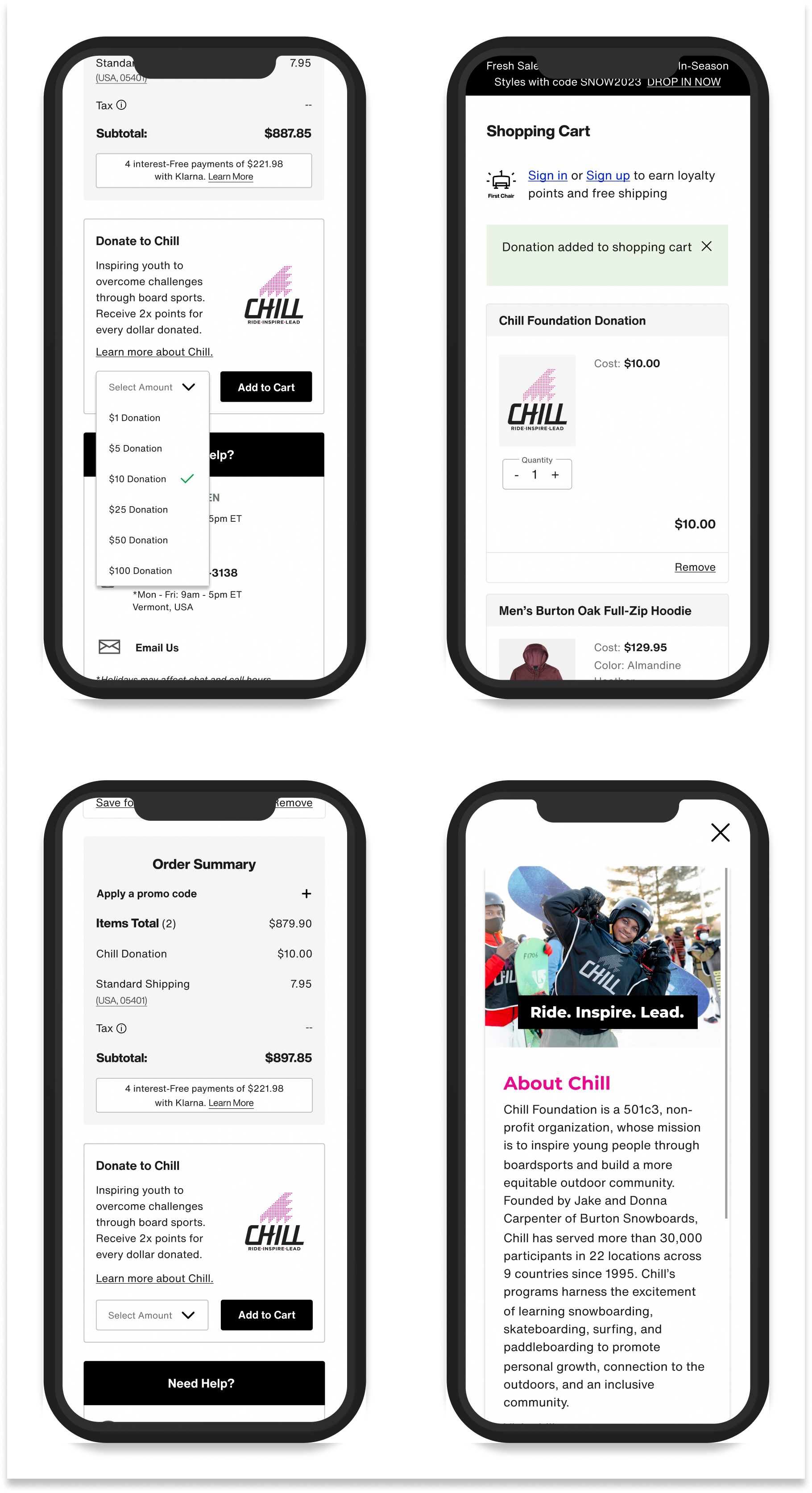
Gift with Purchase: allowing users to opt in or out
Allows users to add/remove/edit gift with purchase selection within cart with option to add back if removed
User validated interaction design
Accommodates size runs
Chill Donation: enhanced visual design and confirmation messaging
Clear confirmation messaging and price adjustment
Donation line item added to order summary, per usability findings
Updated widget design with more expected dropdown interaction
Enhanced visual design and updated copy to include 2x Loyalty points for donations
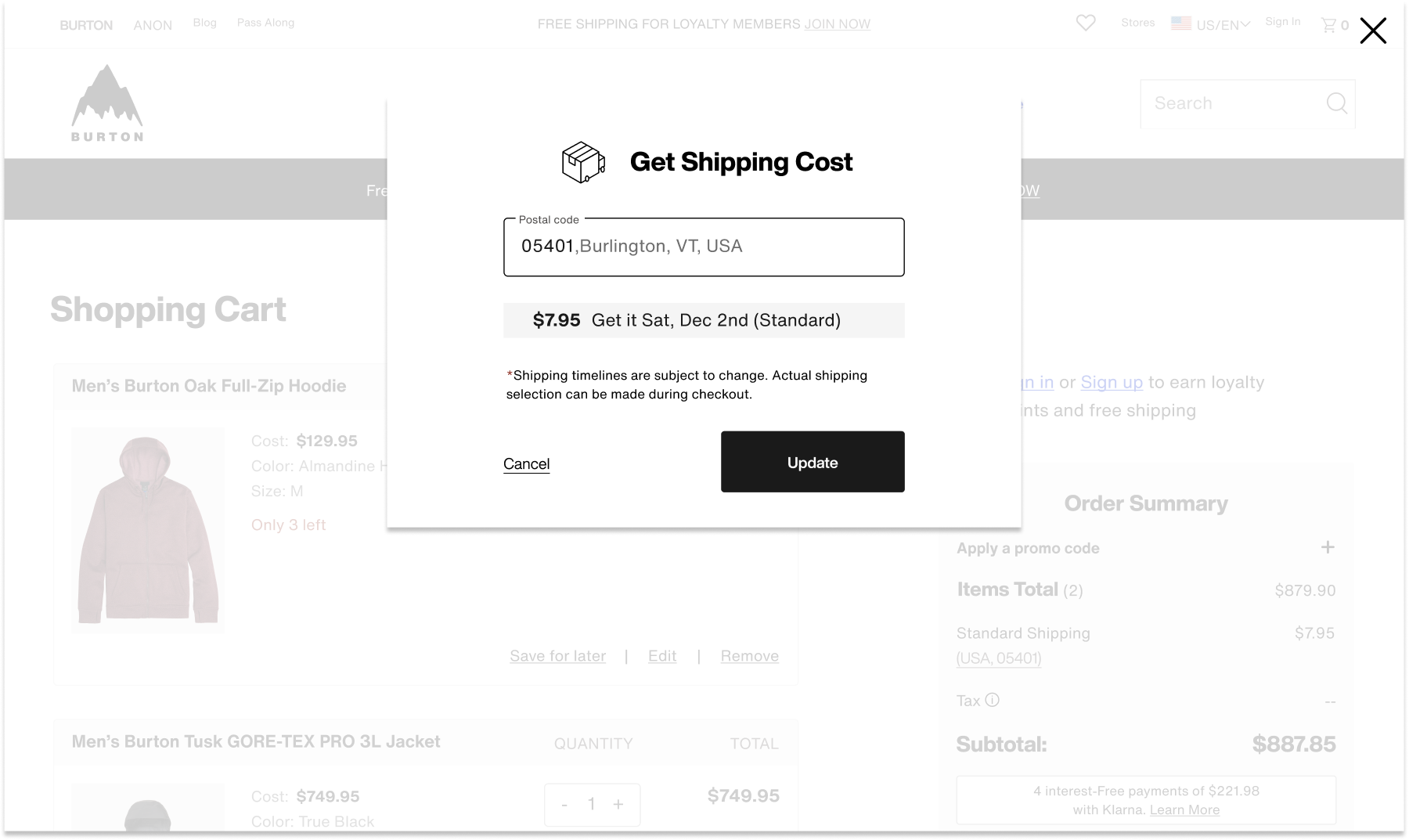
Shipping Cost Modal: exacting shipping costs and delivery windows
Pre-populates zip code and corresponding costs based on geo-location
Answered user desire for cost transparency and shipping timeline by exacting cost and shipping window before entering checkout.
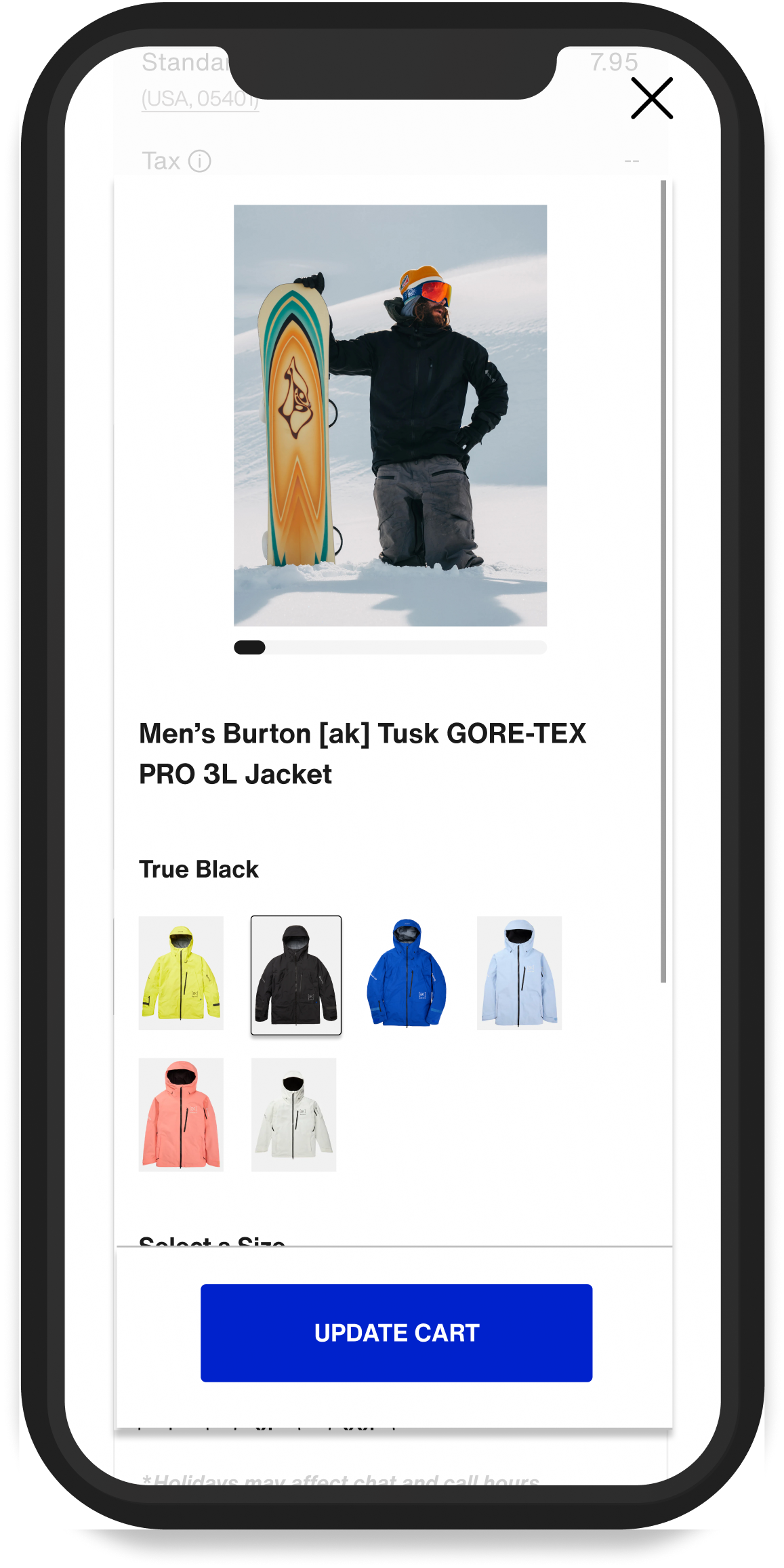
Product Edit Modal: Minimizing the need to leave the cart to make selection updates.
Users can easily review and edit product variations within the cart
Includes full image gallery and dynamic pricing/availability for ease of selection
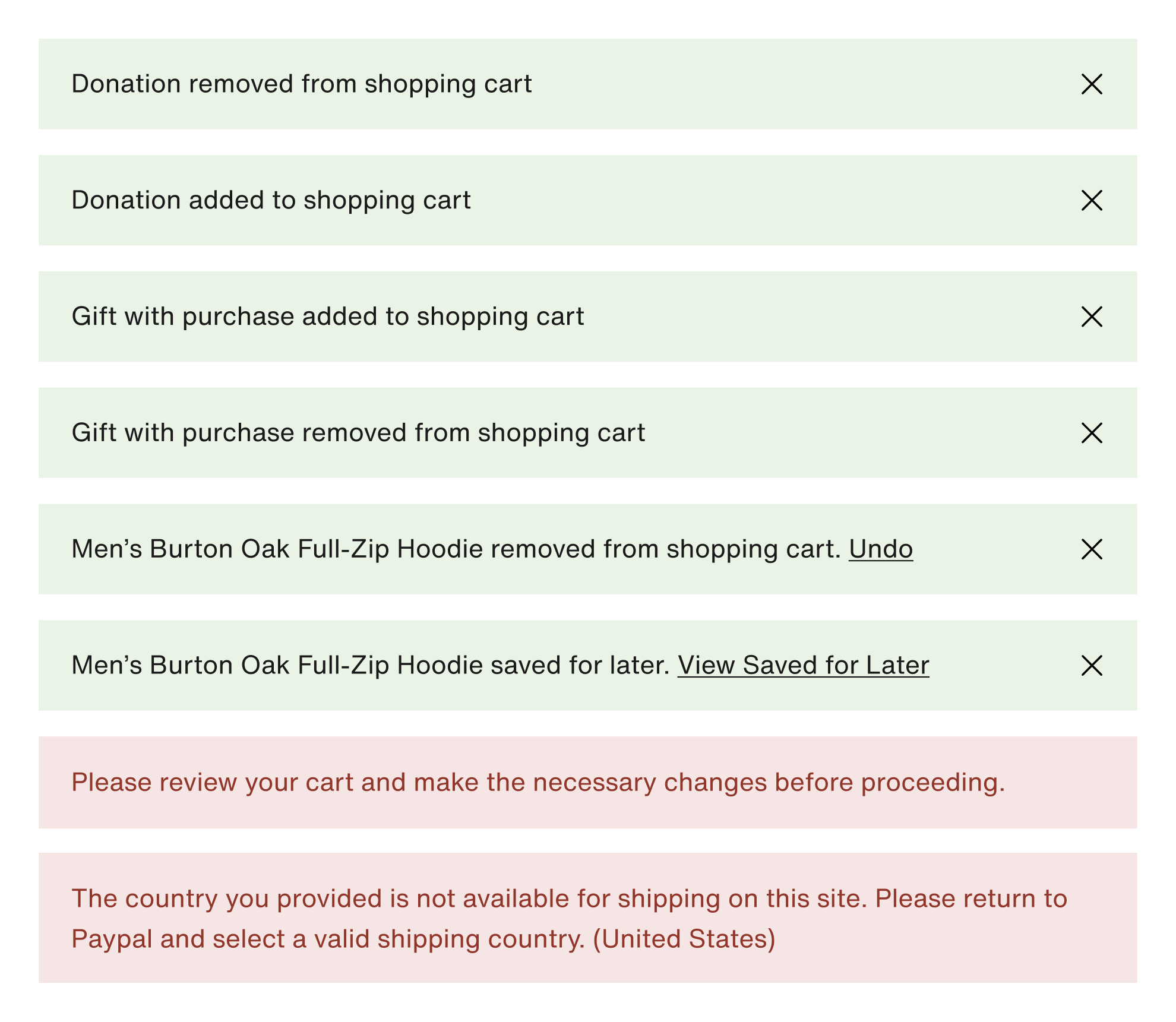
New Toast Messaging System: providing confirmation of actions and error prevention
Created a new toast messaging system to communicate important messaging needed to proceed to checkout
Messaging consistently located at the top of cart for find-ability
New confirmation of actions in GREEN. Undo and view saved for later actions included to ease list refinement
Error messaging in RED with corresponding disabled checkout button.
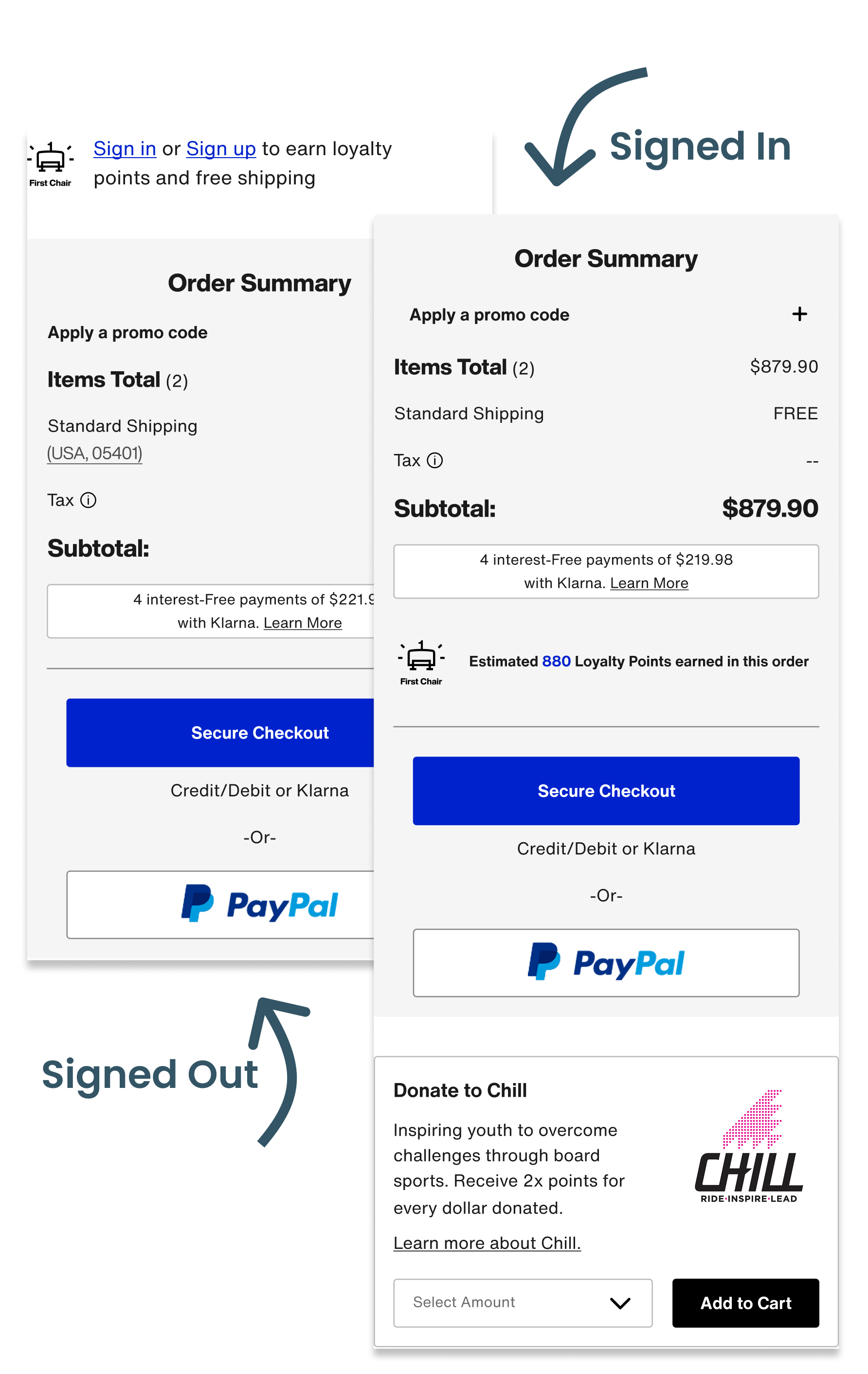
Loyalty member info:
completing the user journey
New “sign in or sign up” messaging near order summary reminds members of free shipping benefit and incentivizes new member sign-up.
New estimated loyalty points calculator illustrates program benefit.
2X Points on Chill donations now reflected in the cart experience
How We’ll Measure Success
Analytics Data
- Cart Abandonment
- Conversion rate
- Overall engagement rates with key features
Goals:
- Reduce cart abandonment
- Increase conversion rate
- High engagement
Customer Service Data
- Measure year over year promo code related customer service tickets
Goal:
- Reduce promo code related customer service tickets
New Reviews and
Loyalty Members
- Year over year Chill Donations
- Year over year First Chair loyalty Sign ups
Goals:
- Increase in Chill donations from cart
- Increase in new First Chair loyalty members
Want to see it in action?
Check it out live !
And while you’re at it, consider buying some really cool gear :)
DEVELOPMENT HANDOFF
Designing Beyond
the Screen
This project was exciting for reasons beyond the UI. Through this project, our UX team had the opportunity to establish a new handoff process with a goals of improving clarity, collaboration, and speed.
Implementing Figma Dev Mode into our workflow:
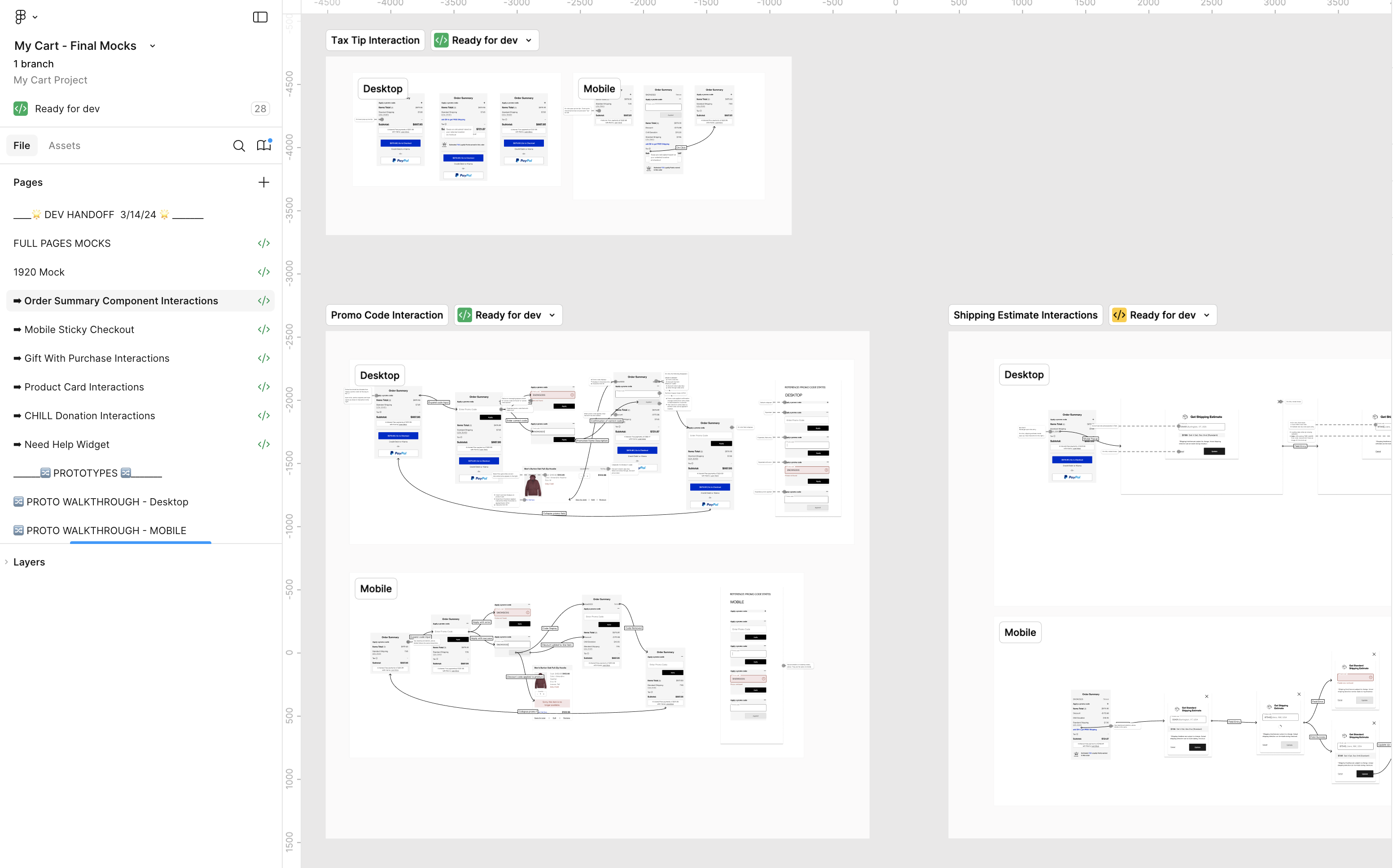
In conjunction with our newly established Design System, we leveraged Figma dev mode features to build a clear workflow that integrated with our Jira ticketing system, and matched css styles. I created a new handoff process and trained developers how to use the dev mode features we implemented.Defining and aligning our process improved our teams speed and execution. We leveraged the “Ready for Dev” feature to communicate design readiness and changes. Linking designs to tickets through the new Jira/Figma integration provided a single source of truth. Where there was formerly a sea of screenshots buried in Jira ticket comments, there was now one design file with descriptive annotations and clear change logs.
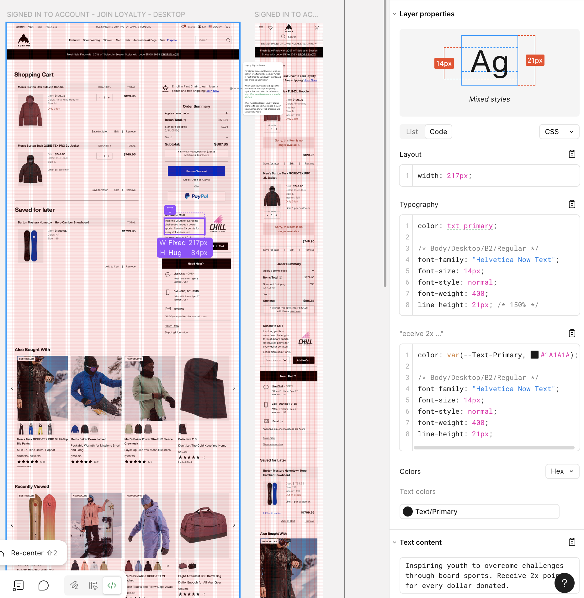
Handoff File: communicating the breadth of interactions
Shopping cart scenarios were seemingly endless when considering the level of promotions, regional nuances, error states, purchase restrictions, etc.
I met with developers and product owners to understand the design handoff requirements and find the balance between over and under communicating interactions.
In addition to providing full page mock ups for unique cart states (regional variation, signed in/out, error states), I created interaction flows for each cart feature. Additionally, I built out component variations for all possible states so that developers could easily view scenarios using the component playground.
Results to be proud of:
Reduced back and forth,
faster development:
After a singular Dev handoff meeting, we significantly reduced back and forth communication between design and development, taking it 100% offline by communicating within our newly established system. This sped up development.
Reduced QA times by 50%:
we cut our QA testing window in half because execution of designs showed drastic improvement from previous projects.
Repeatable process:
This process has carried into our subsequent projects and we continue to improve development speeds and design execution.


2024

E-Commerce Shopping Cart
This end-to-end research and redesign effort delivered a modern shopping cart UI optimized to drive user confidence proceeding to checkout.
Stay tuned at the bottom to learn about how I created a new design handoff process, increasing development accuracy and speed — reducing QA time by 50%.
End-to-end design
Global Audience
Workflow Improvement
Project Overview
End-to-end design process to re-design the Burton.com Shopping cart.
Who
Burton Snowboards is a global leader in snowboards, outerwear, and apparel. Known for quality and style, the brand serves a lifestyle-driven audience of outdoor enthusiasts.
Project Timeline
- UX Research and Design – 4 Months
- Development and QA Testing – 4 Months
Scope
1 page, Desktop and Mobile
Team
- UX Designer – Kimberly MacKenzie
- UX Researcher – Bethany Sadler-Jasmin
- Project Manager – Cierra Ralph
- Developers – Burton internal web development team
Stakeholders
- Regional e-commerce teams
- Global web merchandising team
- Burton Guides (Customer Service)
- Growth marketing team
Tools
- Research: Content Square, Userlytics
- Design and prototyping: Figma
Want to see it in action?
Check it out live!
While you’re at it, consider buying some really cool gear :)
- Background
The Burton.com shopping cart required a code refactor, providing an opportunity to re-design the UI and stand-up new features requested by stakeholders. Cart abandonment was high (65%), leading our team to investigate what features might be added or optimized to instill user confidence proceeding to checkout.
My Role:
As the UX designer, I led wireframing, prototyping, and high-fidelity mockups for development handoff. I partnered with our UX researcher to turn insights into design decisions and collaborated with developers to establish a scalable handoff process. I was responsible for researching and implementing Figma Dev mode, training developers on the feature and its integrations with our design library and Jira ticketing system.
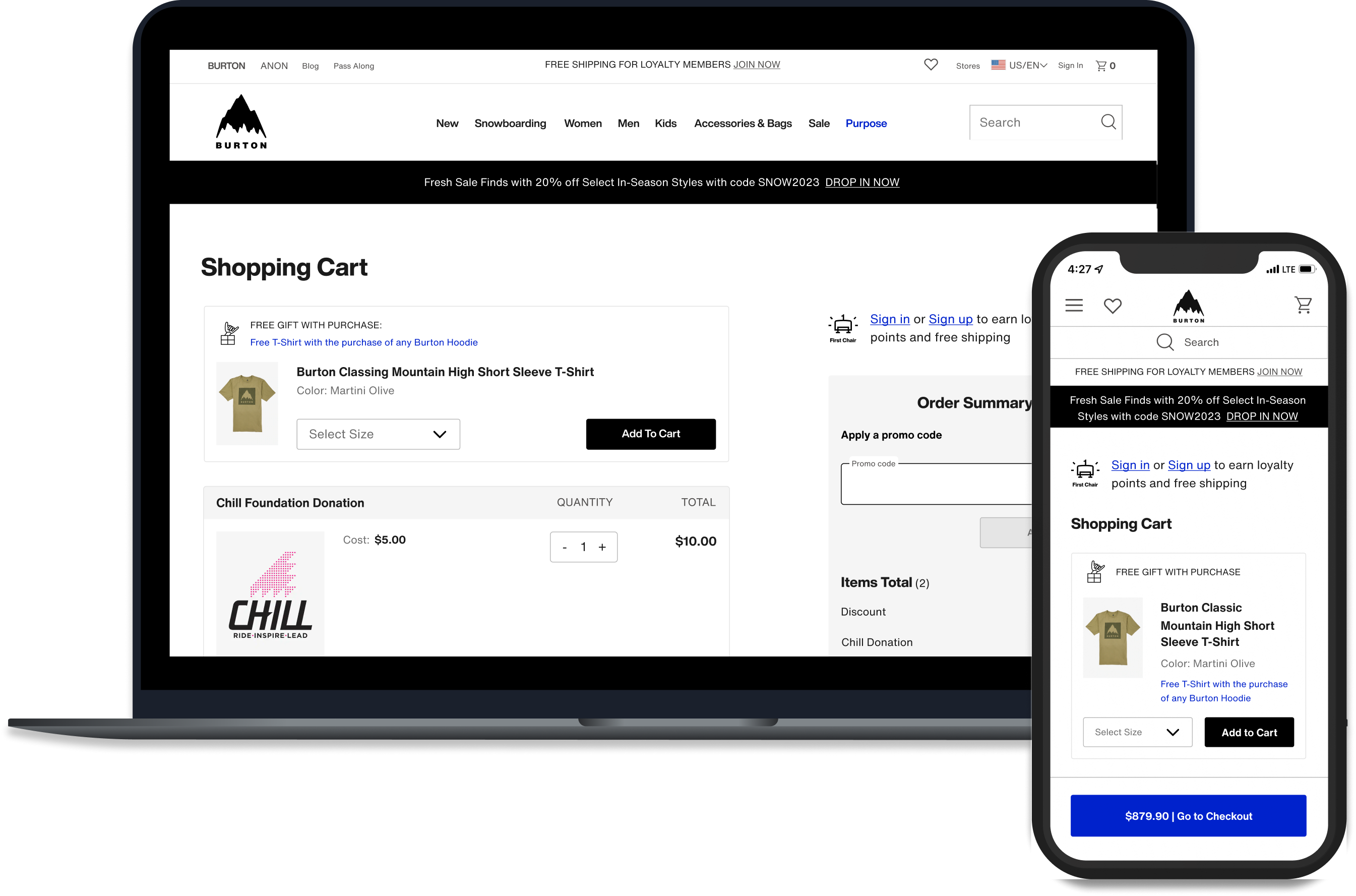
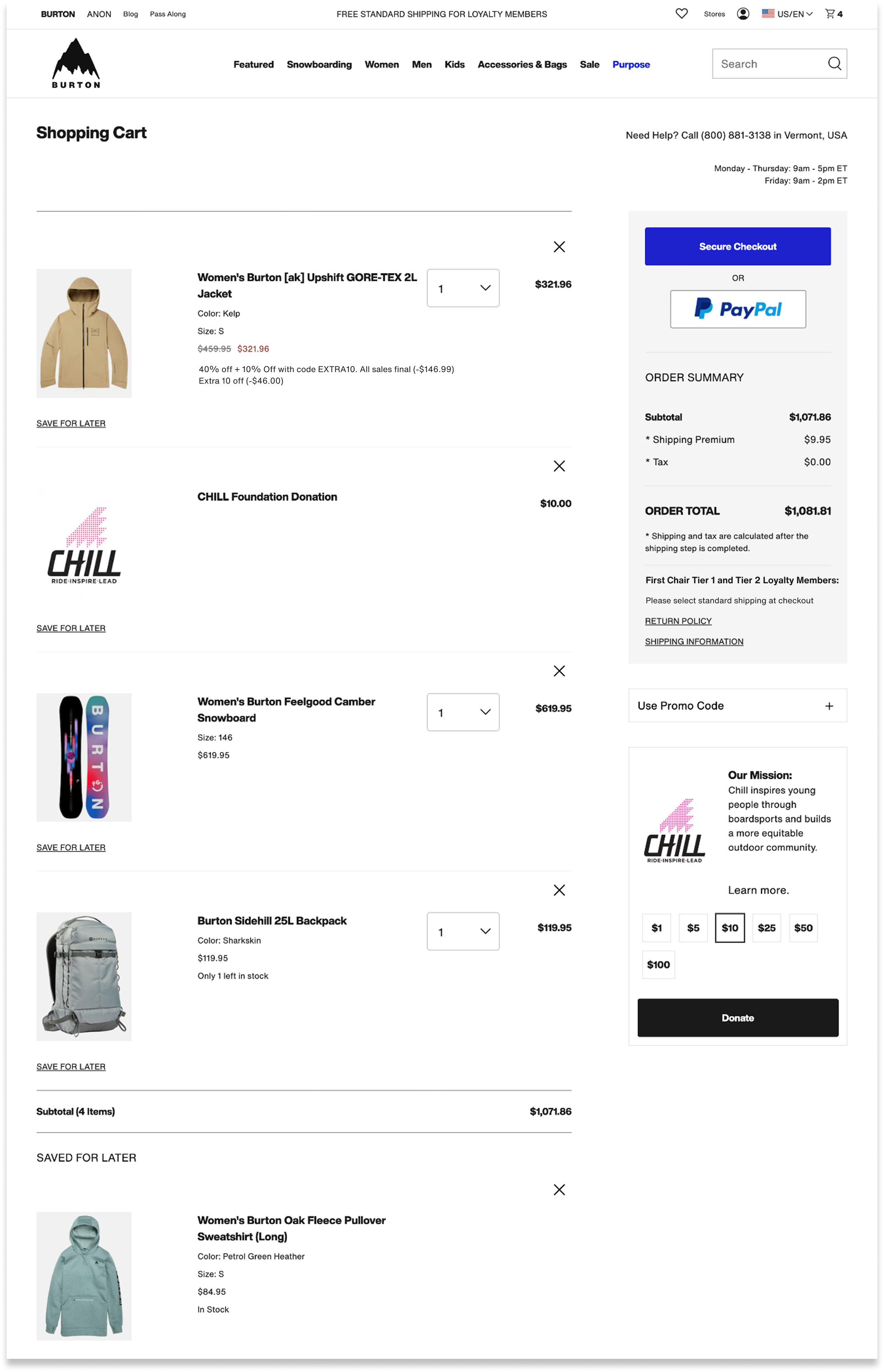
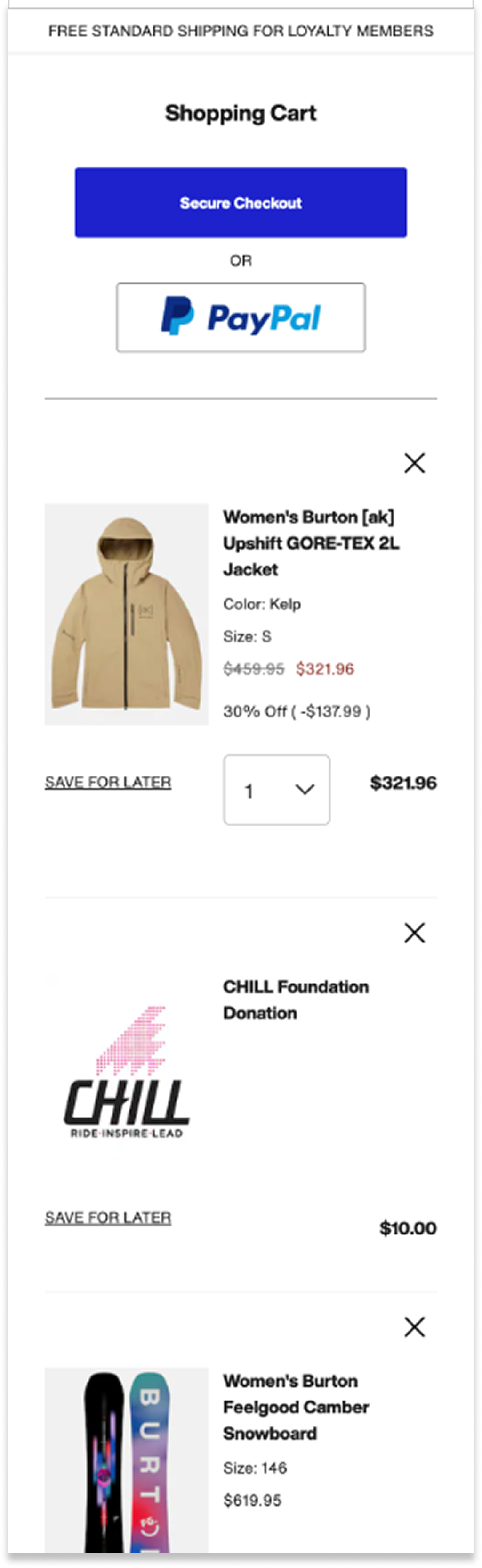
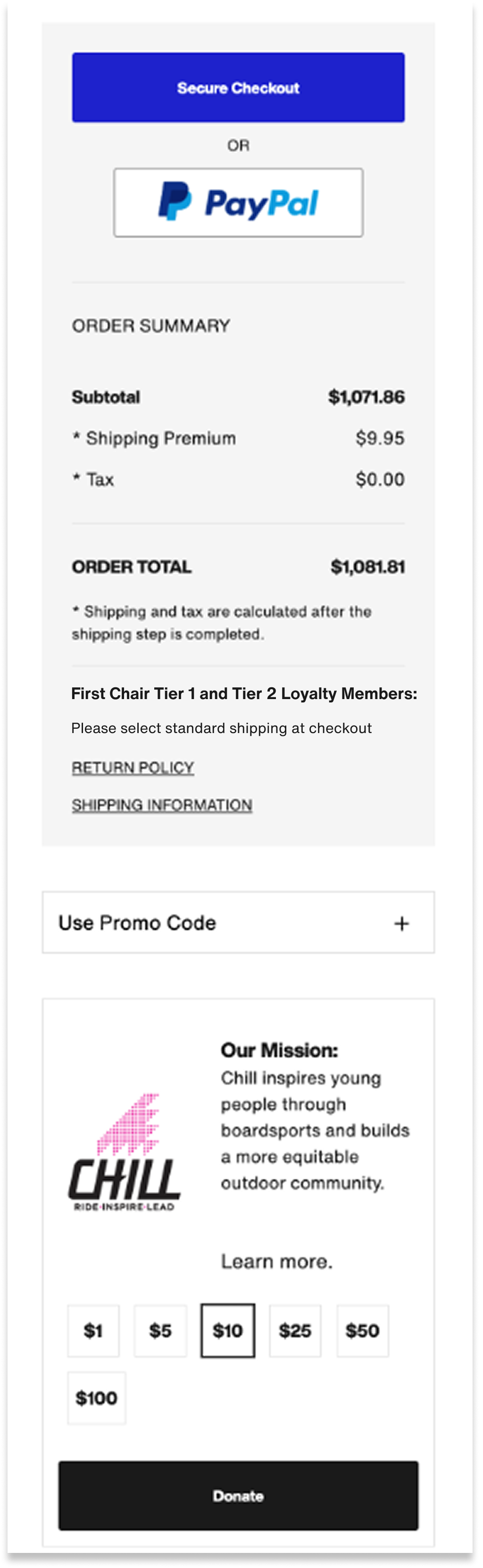
Old Cart Design:
Desktop
Mobile
Mobile cont’d
- UX Discovery
As a UX team, we gathered information from the following sources to identify project goals:
- Site Analytics & Heuristic Evaluation
- 65% Cart Abandonment Rate:Burton.com had a 65% Cart abandonment rate (slightly above average)
- Mobile conversion rate was low:Mobile traffic was significantly higher than desktop, with much lower conversion rates. While this behavior is somewhat typical, there was opportunity to increase conversion on mobile.
- UI Design was dated and bloated:While old design was effective, it looked dated, and years of bloat led to overly word copy and complicated pricing. We hypothesized that clearer language and modernized design would increase user confidence and trust.
- Opportunity to improve user control and freedomThe old site lacked confirmation and “undo” of actions like removing items, saving them for later, etc.
- No mention of Loyalty program benefitsWe recently launched a loyalty program that offered free shipping, points per order, and 2X points for Chill donations. None of this was called out in the cart.
- Stakeholder Requirements
- Optimize promo code feature:Across global regions, merchandising teams required promotion capabilities including the ability to both stack and overwrite, tie to specific products or categories, require codes or auto-apply.
- More flexible gift with purchase feature:Merchandisers desired an enhanced gift with purchase feature to include size selection. Customer service teams cautioned that they often received return requests for gifts with purchase thought to be received by accident.
- Add an “Edit Item” featureThis feature was out the box with Salesforce and required minimal development lift.
- Increase Chill Donations:Our non-profit affiliate, Chill Foundation, asked that we explore ways to increase Chill donations from the cart.
- 3rd Party Research
(Baymard Institute, Nielsen Norman Group)
- Reasons for cart abandonment:Research told us key reasons for cart abandonment had to do with extra costs at checkout, slow delivery, complicated checkout processes, and concerns with payment security.
- Hide promo code field behind a link:Research recommendations included hiding Promo codes behind a link to avoid distracting users, while still making the feature easily findable and codes easy to apply.
- Competitor Analysis
- Reviewed best in class examples:We scoured the web to explore best in class checkout examples to learn how other sites displayed clear pricing, communicated shipping speeds and fees, and instilled trust and payment security.
- Understand user expectations:For feature requests like gift with purchase and edit item, we explored examples within our competitor landscape and beyond to understand user’s mental models so we could design for familiarity.


Design Opportunities
- Reduce 65% Cart Abandonment Rate
- Increase mobile conversion by optimizing mobile checkout flow
- Improve clarity and trust with modernized design, simplified copy, and straightforward pricing
- Complete the user journey for new First Chair Loyalty program
Problem Statement:
Burton.com needed a shopping cart design that enabled users to proceed to checkout with confidence, clarity, and ease.


Constraints
We reviewed our discovery findings and subsequent UX goals with our development team and identified the following constraints:
- Needed to leverage salesforce reference architecture (SFRA)To stay within scope, the redesigned features needed to align with the native behaviors of SFRA, which the development team used to rebuild the cart.
- User Expectations vs. Shipping and Return Policy RealtiesUser research highlighted a strong expectation for free shipping and returns, but the existing policy required users to pay—creating a challenge in building trust and confidence through the cart experience.
- Project scope was limited to the cart pagerequested features needed to exist on the cart page and could not be implemented in different parts of the user journey. In example, gift with purchase could not be introduced earlier in the user flow, and promo code fields could not be added to checkout.
- Prototyping and Usability Testing:
Building on our discovery findings, we launched a usability study across North America and Europe, testing three desktop and three mobile prototypes with varying information architecture and key feature designs.
Three Prototype Layouts:
Prototype 1:
Prototype 2:
Prototype 3:
Version 2
Version 3
Version 1


Usability Study


Research Goals
Validate design usability across all three protypes and identify preferred overall layout
Promo code placement:We tested a new link treatment and a new placement of the promo code feature against a similar (open field) treatment from the existing design
Checkout CTA:On Desktop, we tested the placement of the CTA Button at the top vs. the bottom of the order summary. On mobile we tested a sticky Checkout CTA
Gift with Purchase design:We explored several design treatments to make the gift with purchase clearly recognizable as a free item.
Chill Donation CTA:Observe user behavior around the donation feature to see if different placements on the page elicite positive/negative responses or a greater interest in donating
New Shipping Cost Modal:Tested a new shipping modal feature that exacted shipping fees based on zip code.
Product Edit Feauture:Test new feature and gauge usefulness

Findings
All three prototypes got a positive response and were perceived as clean and easy to use.
Promo code placement:Users felt all three variations were easy to see and interact with. Of the three design treatments, there was no clear standout.
Checkout CTA:As hypothesized, users overwhelmingly preferred the placement of the checkout button below the order summary. The sticky checkout button performed very well with all users finding it quickly and easily.
Gift with Purchase design:Users strongly preferred the gift with purchase variation that permitted them to add the item back to their cart if they removed it.
Chill Donation CTA:Users were somewhat offput by a donation widget at the top of the shopping cart. We learned the majority of users expected to see a donation line item in the order summary (rather than being grouped with cart items).
New Shipping Cost Modal:Users much preferred the experience with a shipping calculator vs. a static “estimated shipping” line item in the order summary.
Product edit: Feature was a huge delighter across both countries, all users rating as easy to use and very helpful.
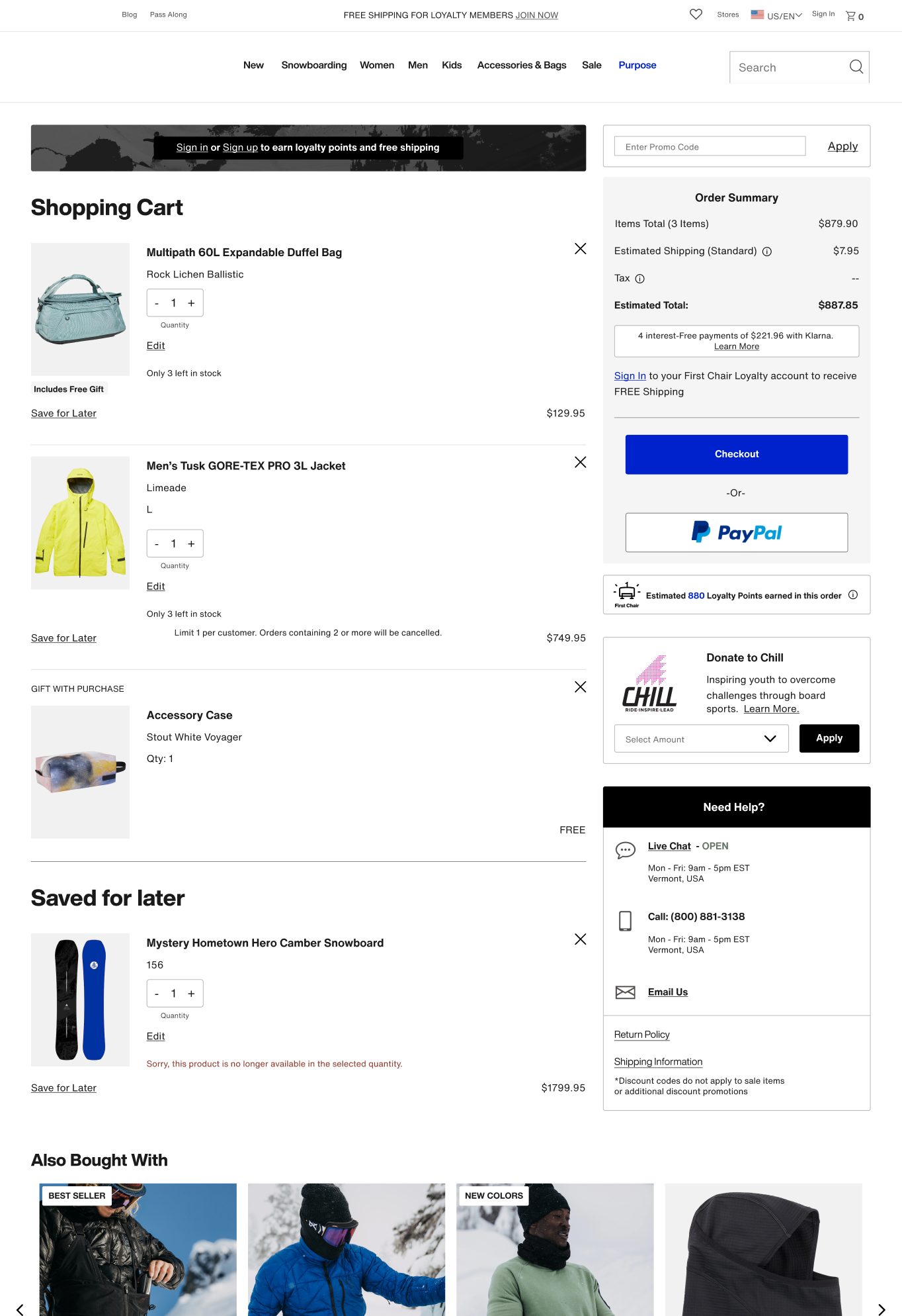
- Final Design Highlights
Promo code: distilling complexities into intuitive interactions with clear pricing
Accommodates various promotion types that are stackable
Placed promo code behind a link. This maintained find-ability while reducing
user distraction.
Introduced valid/invalid states for applied codes. Solving for technical constraint inhibiting overwrites on inactive codes.
Enabled a nano-banner at top of the cart that displays current promo codes for easy recognition rather than recall.
Mobile Sticky Checkout Button:
one clear path forward to checkout
Nested all payment types behind a sticky Checkout button
Reduced cognitive load and increased speed to checkout by presenting one clear path forward
Gift with Purchase: allowing users to opt in or out
Allows users to add/remove/edit gift with purchase selection within cart with option to add back if removed
User validated interaction design
Accommodates size runs
Chill Donation: enhanced visual design and confirmation messaging
Clear confirmation messaging and price adjustment
Donation line item added to order summary, per usability findings
Updated widget design with more expected dropdown interaction
Enhanced visual design and updated copy to include 2x Loyalty points for donations
Shipping Cost Modal: exacting shipping costs and delivery windows
Pre-populates zip code and corresponding costs based on geo-location
Answered user desire for cost transparency and shipping timeline by exacting cost and shipping window before entering checkout.
Product Edit Modal: Minimizing the need to leave the cart to make selection updates.
Users can easily review and edit product variations within the cart
Includes full image gallery and dynamic pricing/availability for ease of selection
New Toast Messaging System: providing confirmation of actions and error prevention
Created a new toast messaging system to communicate important messaging needed to proceed to checkout
Messaging consistently located at the top of cart for find-ability
New confirmation of actions in GREEN. Undo and view saved for later actions included to ease list refinement
Error messaging in RED with corresponding disabled checkout button.
Loyalty member info:
completing the user journey
New “sign in or sign up” messaging near order summary reminds members of free shipping benefit and incentivizes new member sign-up.
New estimated loyalty points calculator illustrates program benefit.
2X Points on Chill donations now reflected in the cart experience
How We’ll Measure Success
Analytics Data
- Cart Abandonment
- Conversion rate
- Overall engagement rates with key features
Goals:
- Reduce cart abandonment
- Increase conversion rate
- High engagement
Service Cloud Data
- Measure year over year promo code related customer service tickets
Goal:
- Reduce promo code related customer service tickets
Chill Donations and Loyalty
Sign up
- Year over year Chill Donations
- Year over year First Chair loyalty Sign ups
Goals:
- Increase in Chill donations from cart
- Increase in new First Chair loyalty members
Want to see it in action?
Check it out live!
While you’re at it, consider buying some really cool gear :)
DEVELOPMENT HANDOFF
Designing Beyond the Screen
This project was exciting for reasons beyond the UI. Through this project, our UX team had the opportunity to establish a new handoff process with a goals of improving clarity, collaboration, and speed.
Implementing Figma Dev Mode into our workflow:
In conjunction with our newly established Design System, we leveraged Figma dev mode features to build a clear workflow that integrated with our Jira ticketing system, and matched css styles. I created a new handoff process and trained developers how to use the dev mode features we implemented.Defining and aligning our process improved our teams speed and execution. We leveraged the “Ready for Dev” feature to communicate design readiness and changes. Linking designs to tickets through the new Jira/Figma integration provided a single source of truth. Where there was formerly a sea of screenshots buried in Jira ticket comments, there was now one design file with descriptive annotations and clear change logs.
Handoff File: communicating the breadth of interactions
Shopping cart scenarios were seemingly endless when considering the level of promotions, regional nuances, error states, purchase restrictions, etc. I met with developers and product owners to understand the design handoff requirements and find the balance between over and under communicating interactions.
In addition to providing full page mock ups for unique cart states (regional variation, signed in/out, error states), I created interaction flows for each cart feature. Additionally, I built out component variations for all possible states so that developers could easily view scenarios using the component playground.
Results to be Proud of:
Reduced back and forth,
faster development:
After a singular Dev handoff meeting, we significantly reduced back and forth communication between design and development, taking it 100% offline by communicating within our newly established system. This sped up development.
Reduced QA times by 50%:
we cut our QA testing window in half because execution of designs showed drastic improvement from previous projects.
Repeatable process:
This process has carried into our subsequent projects and we continue to improve development speeds and design execution.
