

2023

My Account Redesign
From high chat volumes and frustration clicks to easy self-service tracking, returns and incentivized reviews. This redesign swapped highest click rate from the chat link to the view orders link, decreasing clicks on chat by 96%.
Decreased Clicks on Chat:
-96%
Highest Click Rate:
From: Chat Link → View Orders Link
End-to-end design
Global Audience
Project Overview
End-to-end design process to re-design the “My Account” section of Burton.com.
Who
Burton Snowboards is a global leader in snowboards, outerwear, and apparel. Known for quality and style, the brand serves a lifestyle-driven audience of outdoor enthusiasts.
Project Timeline
- UX Research and Design – 4 Months
- Development and QA Testing – 4 Months
Scope
16 pages, Desktop and Mobile
Team
- UX Designer – Kimberly MacKenzie
- UX Designer – Bethany Jasmin
- Project Manager – Cierra Ralph
- Developers – Burton internal web development team
Stakeholders
- Burton Guides (Customer Service)
- Regional e-commerce teams
- Growth marketing team
- Global web merchandising team
Tools
- Research: Content Square, Userlytics
- Design: Figma
Want to see it in action?
Check it out live!
*You will need to create a Burton.com account
- Background
The business was motivated to redesign and refactor “My Account”, one of the oldest sections of Burton.com, to improve overall user experience and create a standard development environment.
Balancing stakeholder requirements and user research, we improved navigation and intuitiveness of self-service features - while modernizing the look and feel of the UI. The flexible design accommodates new and evolving account sections, including reviews, my lists, and First Chair loyalty program.
My Role:
As UX Designer, I collaborated with the UX Lead to define goals, divide research, and co-create designs. I led card sort research on Order History and owned design for Order History, Account Navigation, FAQ, and My Reviews. Together, we refined interactions and design cohesiveness, built the handoff file, and presented our designs to stakeholders and developers.
Problems with old design:
- Limited functionality
The existing account section lacked features now standard across modern competitor landscape.

Could not Start a return or
warranty claim
Could not track orders from order history
Could not leave a review
on purchases
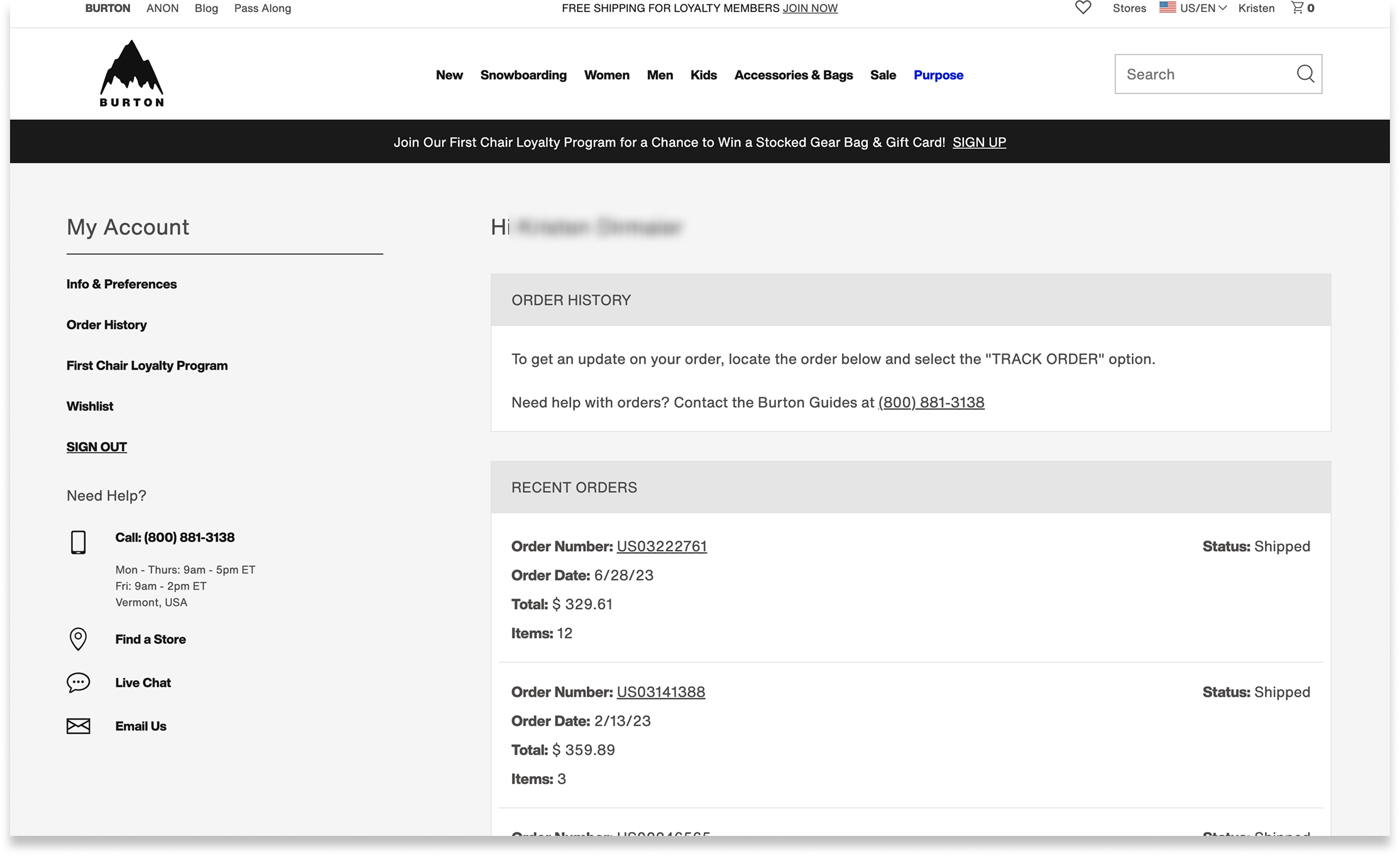
Former order history page
- Inadequate wayfinding
Site analytics suggested users were frustrated and had difficulty finding key features
25% of customer service chats related to “Where is my order?”. Anecdotally, customers sought chat for straight forward tracking questions.
Zoning Analysis - Click Rate
The click rate on “Live Chat” was significantly higher than other page elements. This suggested users resorted to seeking assistance before locating self-service features independently.
- Dated UI Design
Text and color styles did not match the rest of the site
Design looked dated
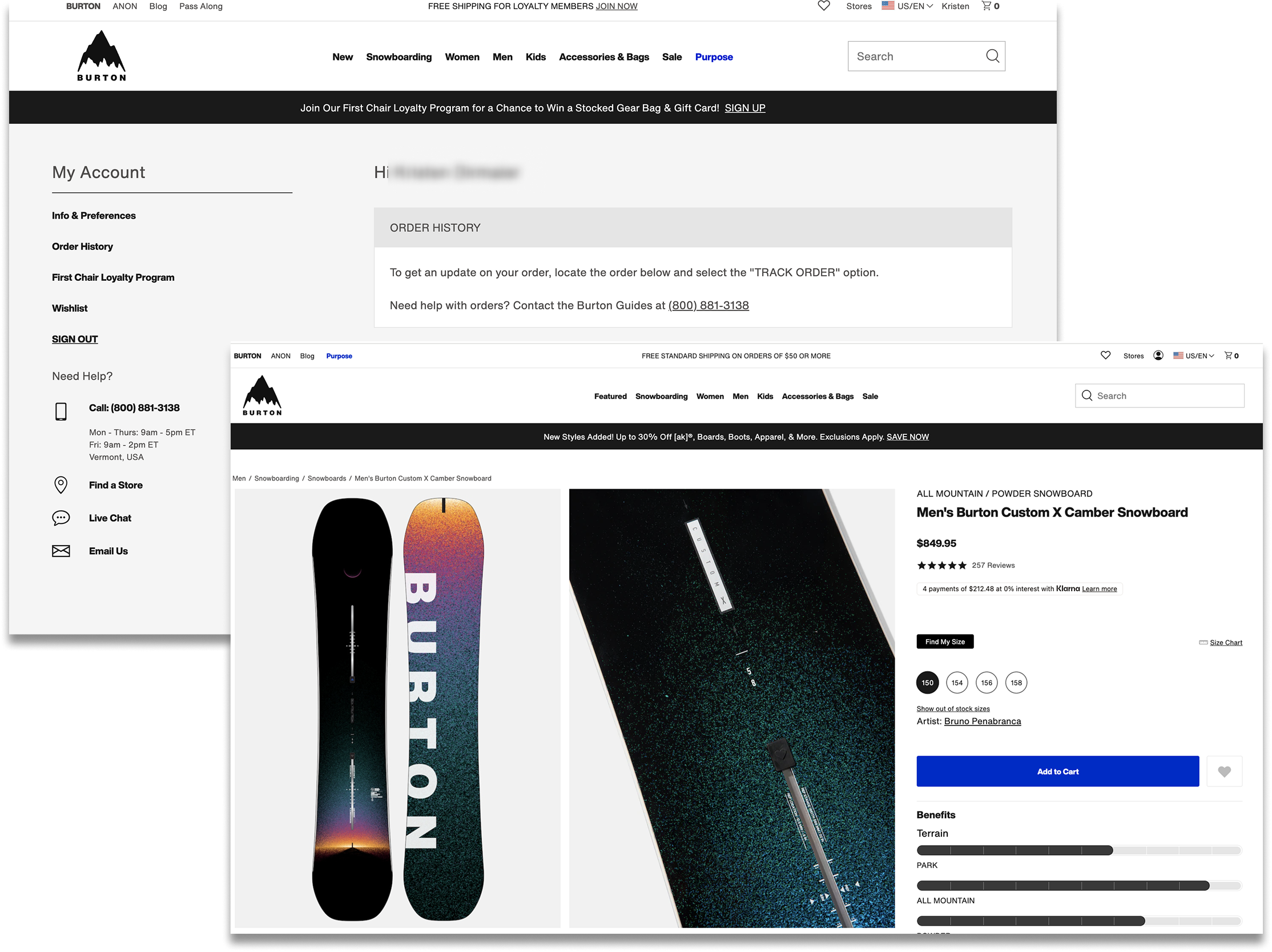
Old Account Design (L) vs. PDP Page (R)
Problem Statement:
Burton.com needed a modernized account section with intuitive navigation — making key features like tracking and returns self-serviceable.


Design Opportunities
- Increase review volume
- Increase First Chair loyalty program sign ups
- Reduce “Where is my order?” query volume to our Burton Guides
- Improve self-service capabilities through improved navigation, added features, clearer language, and faster page load
- Modernize the interface to align with updated brand styling and stand out in our competitor landscape

Gaps in Knowledge
- How do users navigate information in their account?
- How do users expect to see their order details and order history displayed?
- User Research
Study 1: Card Sort
Q: How do we better understand the expectations that consumers have around finding information on their orders, tracking, returns?UX Metrics: • % of users who placed list items into each category • Affinity mapped responses to open form questions and measured percentage of recurring sentiments
Study 2: A/B Tree Test
Q: How do users navigate nested terms to find the information they expect to see within their Accounts?UX Metrics:
• Time on task• Task success• First click analysis• Sentiment analysis for the test (positive, negative, neutral)• Survey question: Reasons for setting up e-commerce account


Research Findings
- Tracking and managing orders was the top reason for users creating accounts on e-commerce sites
- Users spent less time navigating the menu when menu items were more nested, as opposed to more laid out
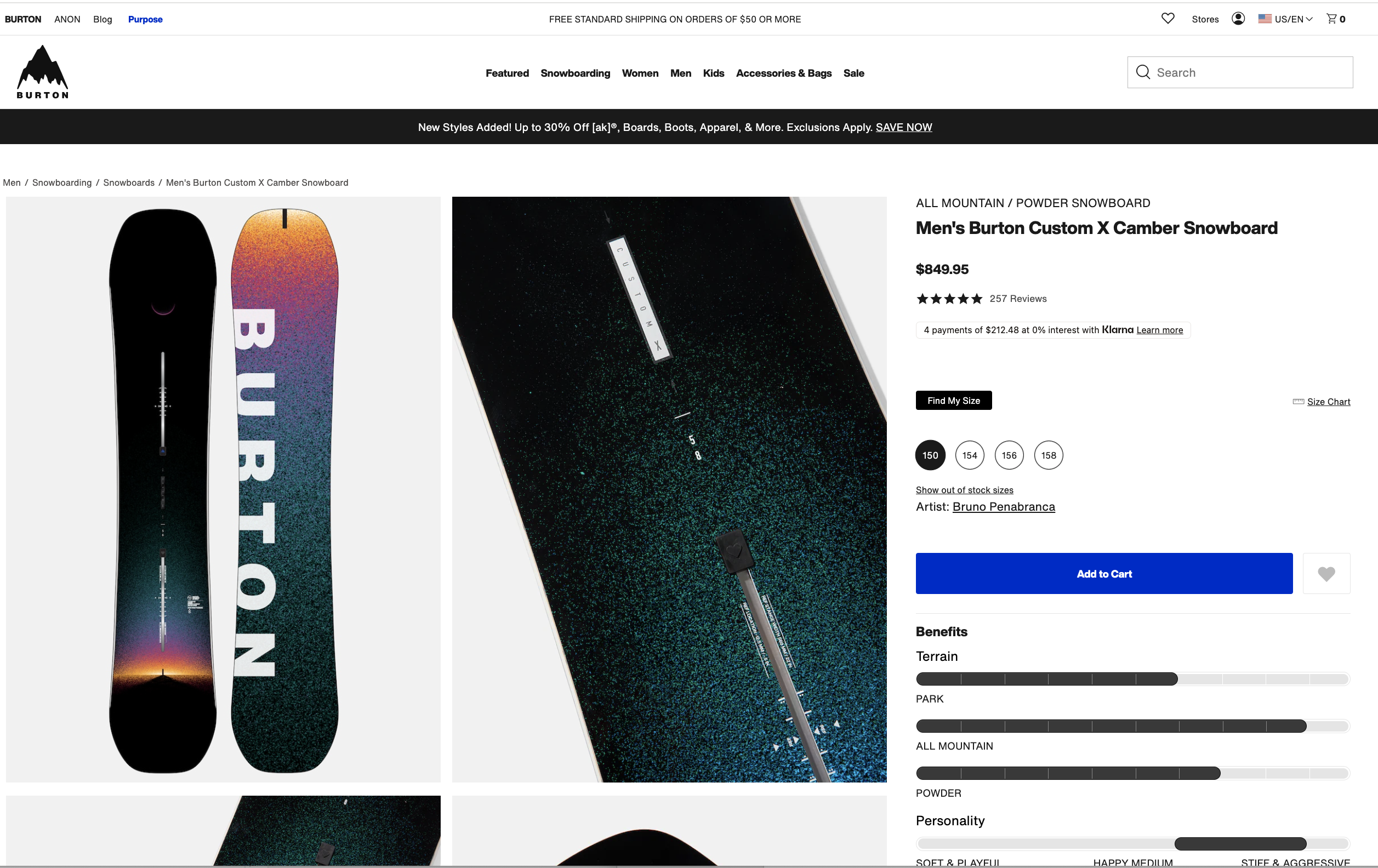
- 68% of users would expect to see an image of the purchased item both on Order History and on Order Details pages.
- 75% of users would expect to see an FAQ in both orders sections
- 44% of users expect to see loyalty points received for each order.
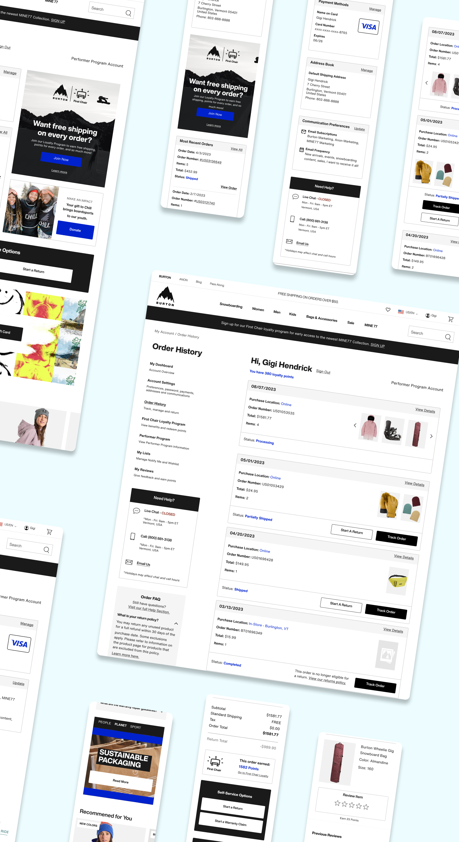
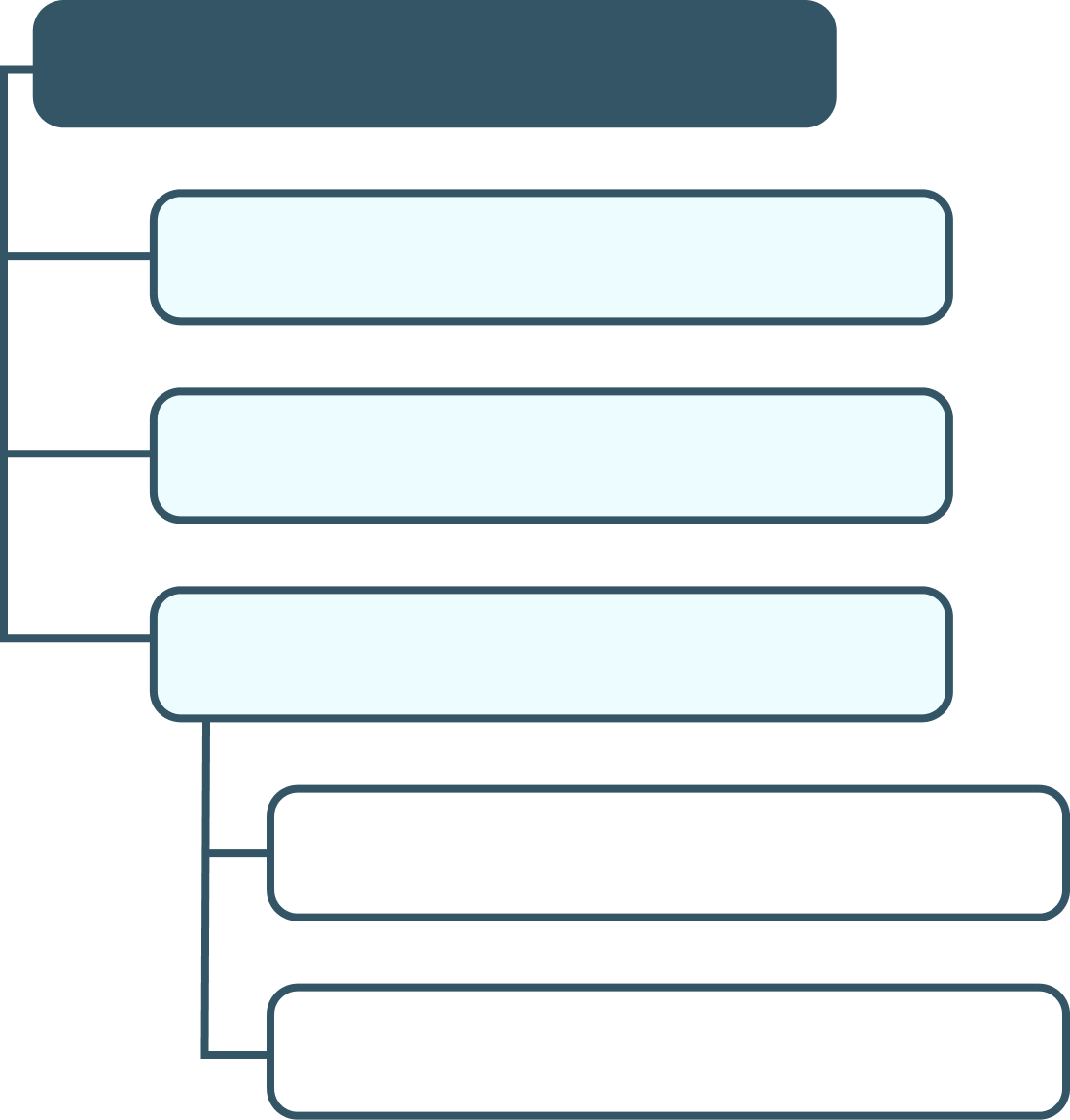
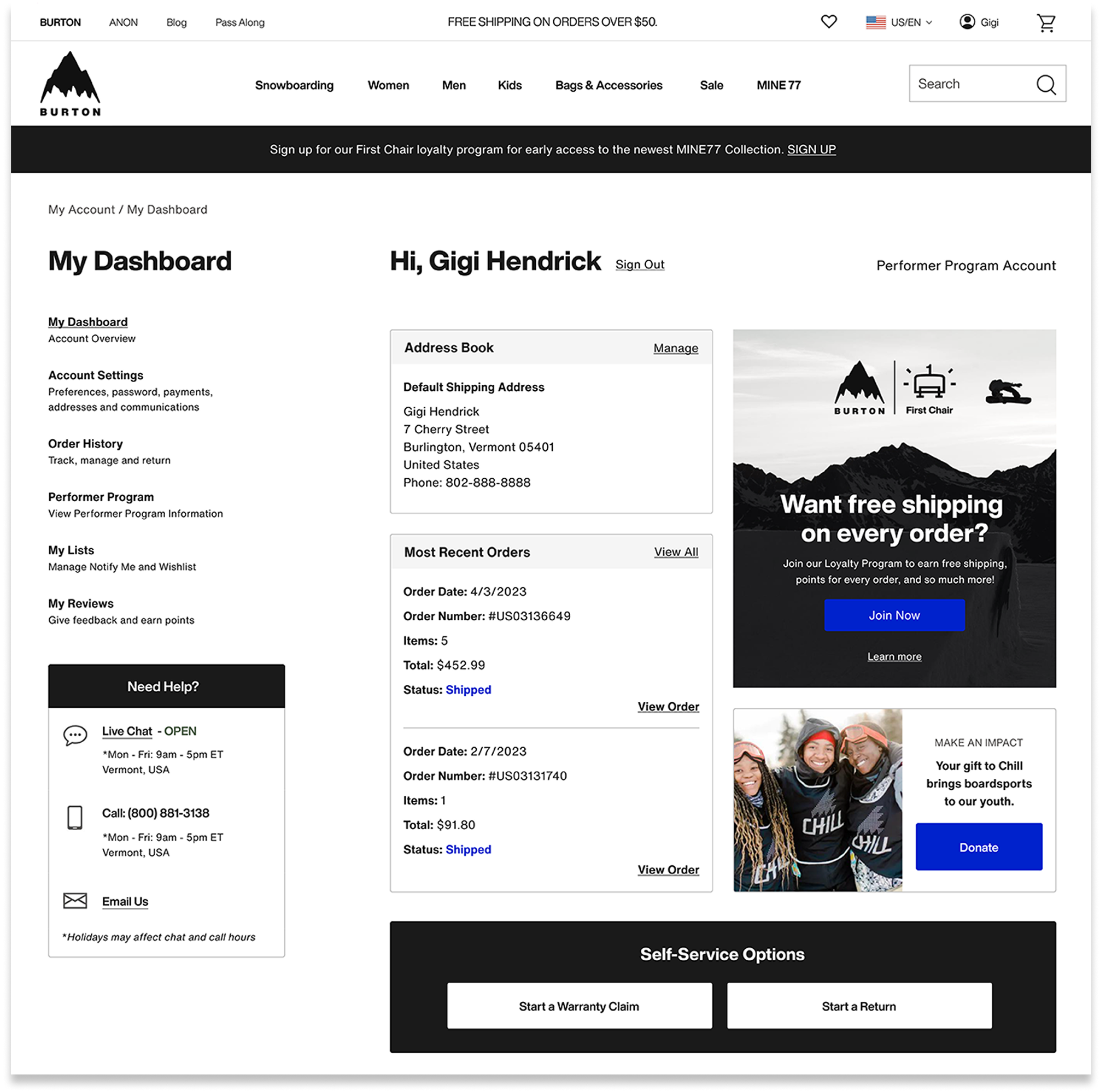
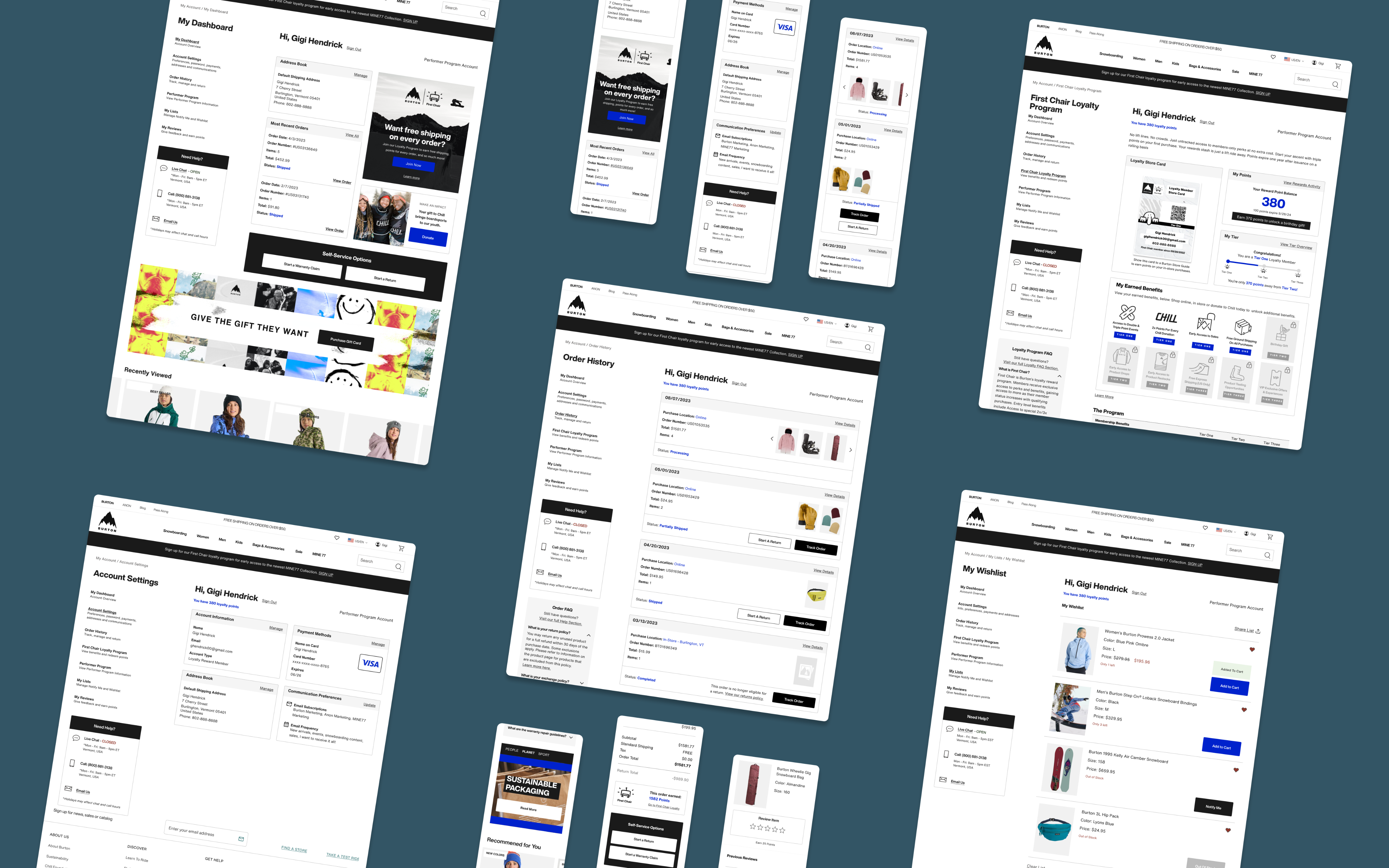
- Final Design Highlights
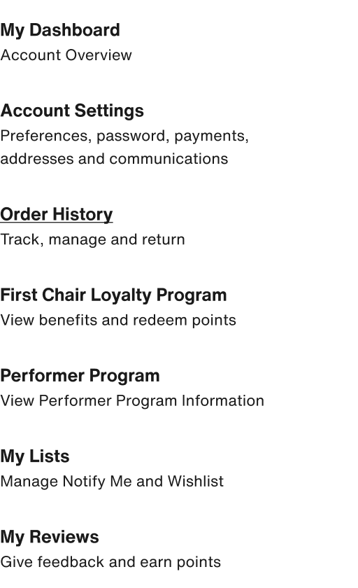
Account Dashboard: quick access to key features

New “My Dashboard” page provides overview of account features
Quick links to key account actions
Card design is modular, allowing flexible content for shifting business goals.
Space for promotional content
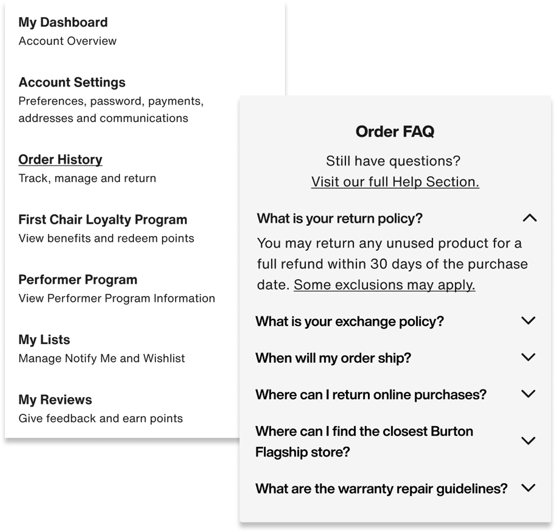
Navigation, FAQ: clarity and speed
Scannable navigation with helper text for nested features
Dynamic page specific FAQ Section
Easy access Help Section throughout the experience
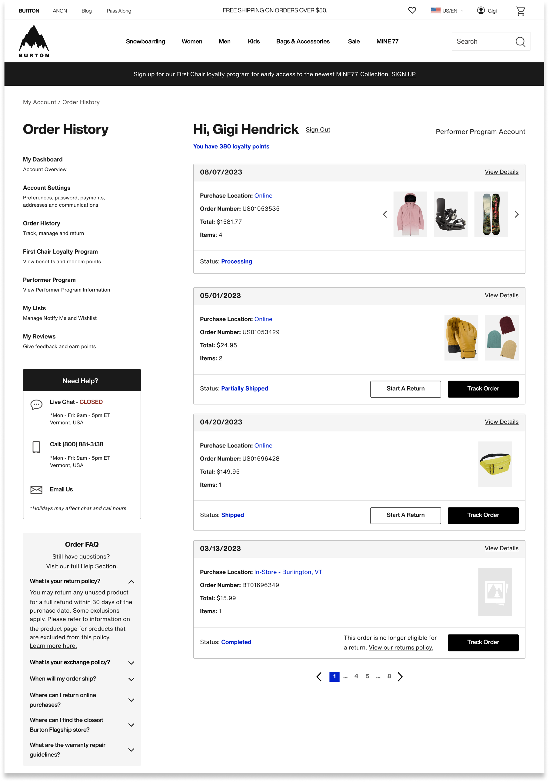
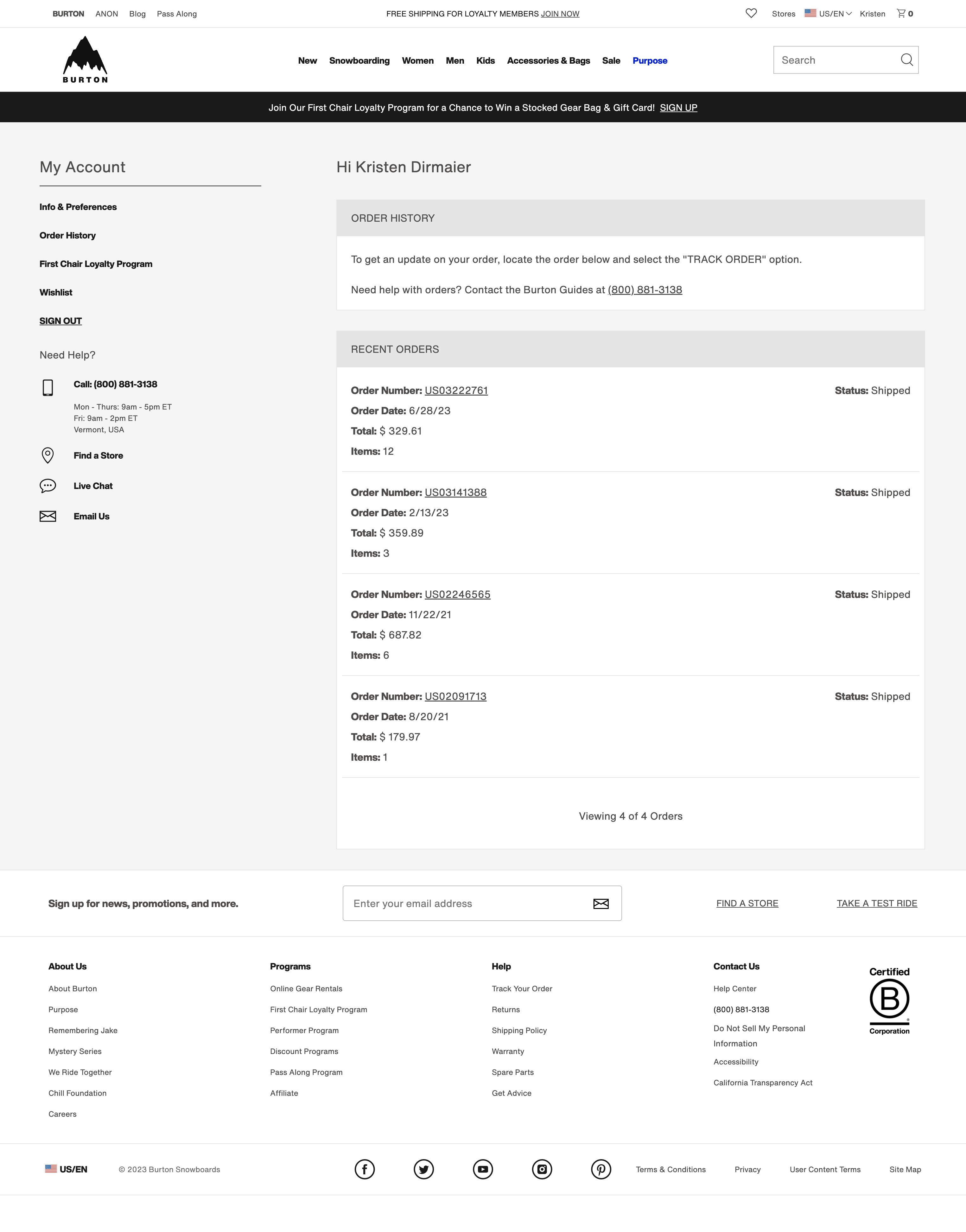
Order History: easy self-service tracking & returns
Tracking, start a return, and warranty actions
Added product images to order history
Dynamic order statuses
Quick access to FAQs and customer service

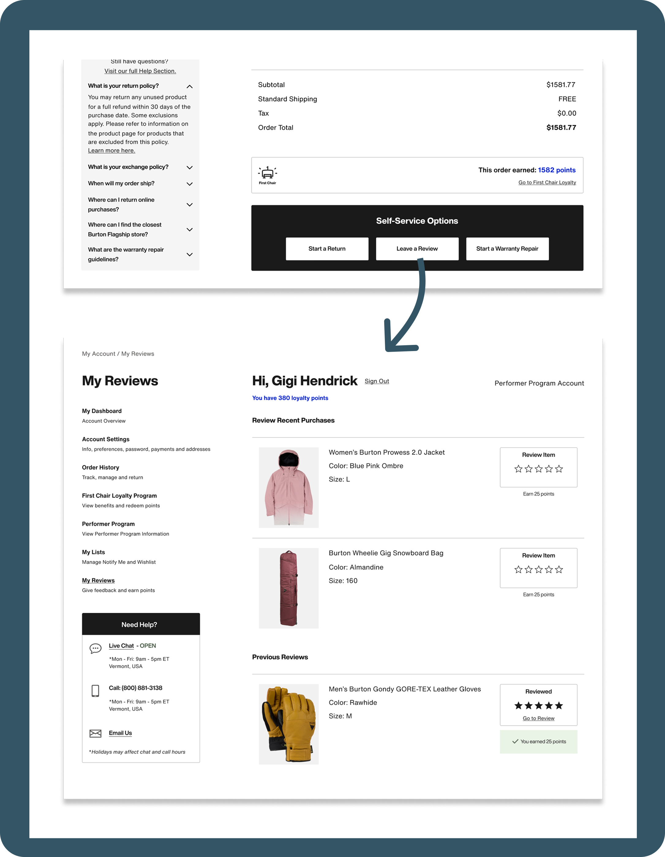
My Reviews: offering incentives while building review volume
New “My Reviews Page”
Path to leave a review from Order Details
Incentivized reviews by offering loyalty points
How We’ll Measure Success
Analytics Data
- Year over year time to first click
- Year over year frustration clicks
- Overall engagement rates with key features
- Click rate to leave reviews and join First Chair loyalty


Goals:
- Faster way finding speeds
- Minimize frustration clicks
- High engagement
Customer Service Data
- Measure year over year “Where is my order?” query volume
Goal:
- Reduce by 30% to free up customer service bandwidth
New Reviews and
Loyalty Members
- Measure year over year review volume
- Measure year over year First Chair loyalty Sign ups
Goals:
- Increase in new reviews
- Increase in new First Chair loyalty members
Want to see it in action?
Check it out live!
*You will need to create a Burton.com account


2023

My Account Redesign
From high chat volumes and frustration clicks to easy self-service tracking, returns and incentivized reviews. This redesign swapped highest click rate from the chat link to the view orders link, decreasing clicks on chat by 96%.
Decreased Clicks on Chat:
-96%
Highest Click Rate:
From: Chat Link → To: View Orders Link
End-to-end design
Global Audience
Project Overview
End-to-end design process to re-design the “My Account” section of Burton.com.
Who
Burton Snowboards is a global leader in snowboards, outerwear, and apparel. Known for quality and style, the brand serves a lifestyle-driven audience of outdoor enthusiasts.
Project Timeline
- UX Research and Design – 4 Months
- Development and QA Testing – 4 Months
Scope
16 pages, Desktop and Mobile
Team
- UX Designer – Kimberly MacKenzie
- UX Designer – Bethany Sadler-Jasmin
- Project Manager – Cierra Ralph
- Developers – Burton internal web development team
Stakeholders
- Burton Guides (Customer Service)
- Regional e-commerce teams
- Growth marketing team
- Global web merchandising team
Tools
- Research: Content Square, Userlytics
- Design: Figma
Want to see it in action?
Check it out live!
*You will need to create a Burton.com account
- Background
The business was motivated to redesign and refactor “My Account”, one of the oldest sections of Burton.com, to improve overall user experience and create a standard development environment.
Balancing stakeholder requirements and user research, we improved navigation and intuitiveness of self-service features - while modernizing the look and feel of the UI. The flexible design accommodates new and evolving account sections, including reviews, my lists, and First Chair loyalty program.
My Role:
As UX Designer, I collaborated with the UX Lead to define goals, divide research, and co-create designs. I led card sort research on Order History and owned design for Order History, Account Navigation, FAQ, and My Reviews. Together, we refined interactions and design cohesiveness, built the handoff file, and presented our designs to stakeholders and developers.
Problems with old design:
- Limited functionality
The existing account section lacked features now standard across modern competitor landscape.
Could not Start a return
or warranty claim
Could not track orders from order history
Could not leave a review
on purchases
Former order history page
- Inadequate wayfinding
Site analytics suggested users were frustrated and had difficulty finding
key features
25% of customer service chats related to “Where is my order?”. Anecdotally, customers sought chat for straight forward tracking questions.
Zoning Analysis - Click Rate
The click rate on “Live Chat” was significantly higher than other page elements. This suggested users resorted to seeking assistance before locating self-service features independently.
- Dated UI Design
Text and color styles did not match the rest of the site
Design looked dated
Old Account Design (L) vs. PDP Page (R)
Problem Statement:
Burton.com needed a modernized account section with intuitive navigation — making key features like tracking and returns self-serviceable.


Design Opportunities
- Increase review volume
- Increase First Chair loyalty program sign ups
- Reduce “Where is my order?” query volume to our Burton Guides
- Improve self-service capabilities through improved navigation, added features, clearer language, and faster page load
- Modernize the interface to align with updated brand styling and stand out in our competitor landscape

Gaps in Knowledge
- How do users navigate information in their account?
- How do users expect to see their order details and order history displayed?
- User Research
Study 1: Card Sort
Q: How do we better understand the expectations that consumers have around finding information on their orders, tracking, returns?UX Metrics: • % of users who placed list items into each category • Affinity mapped responses to open form questions and measured percentage of recurring sentiments
Study 2: A/B Tree Test
Q: How do users navigate nested terms to find the information they expect to see within their Accounts?UX Metrics:• Time on task• Task success• First click analysis• Sentiment analysis for the test (positive, negative, neutral)• Survey question: Reasons for setting up e-commerce account


Research Findings
- Tracking and managing orders was the top reason for users creating accounts on e-commerce sites
- Users spent less time navigating the menu when menu items were more nested, as opposed to more laid out
- 68% of users would expect to see an image of the purchased item both on Order History and on Order Details pages.
- 75% of users would expect to see an FAQ in both orders sections
- 44% of users expect to see loyalty points received for each order.
- Final Design Highlights
Account Dashboard: quick access to key features
New “My Dashboard” page provides overview of account features
Quick links to key account actions
Card design is modular, allowing flexible content for shifting business goals.
Space for promotional content
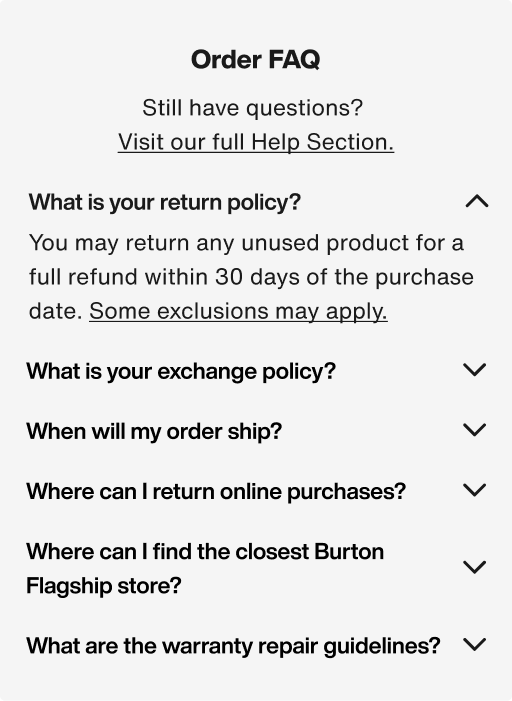
Navigation, FAQ: clarity and speed
Scannable navigation with helper text
for nested features
Dynamic page specific FAQ Section
Easy access Help Section throughout the experience
Order History: easy self-service tracking & returns
Tracking, start a return, and warranty actions
Added product images to order history
Dynamic order statuses
Quick access to FAQs and customer service

My Reviews: My Reviews: offering incentives while building review volume
New “My Reviews Page”
Path to leave a review from Order Details
Incentivized reviews by offering loyalty points
How We’ll Measure Success
Analytics Data
- Year over year time to first click
- Year over year frustration clicks
- Overall engagement rates with key features
- Click rate to leave reviews and join First Chair loyalty
Goals:
- Faster way finding speeds
- Minimize frustration clicks
- High engagement
Customer Service Data
- Measure year over year “Where is my order?” query volume
Goal:
- Reduce by 30% to free up customer service bandwidth
New Reviews and
Loyalty Members
- Measure year over year review volume
- Measure year over year First Chair loyalty Sign ups
Goals:
- Increase in new reviews
- Increase in new First Chair loyalty members
Want to see it in action?
Check it out live!
*You will need to create a Burton.com account